Graph component
The facts and figures of the housing emergency are some of our best assets when it comes to fighting housing injustice. We can use them to add weight and context to the work we're doing.
For showing changes over time and comparisons, a graph is the best solution.
At the moment, our graph component is designed to create a line graph (not bar, pie or area charts as yet).
The line graph component lets you display up to four data sets over a given date range, shown in years. To ensure the graph is useful to all our users, it must include:
a graph title
axes headers
a key (if multiple data sets are being used)
the graph source (if applicable)
a graph summary

To build the graph component (line graph)
Review the data .csv to ensure the information is clear, logical and accessible. You can display up to four data sets over a given date range, shown in years.
Use Add Entry and select Component – Graph
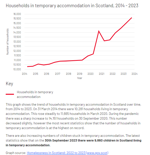
Title – give the graph a clear, meaningful title so users can easily understand what data they're looking at (even if the graph is removed from its original context)
Y axis label – add a label (e.g. Number of households) to the Y axis (vertical axis), so users and assistive technologies can read the data being represented
X axis label – add the label 'Year' to the X (horizontal) axis. Currently, this is the only value label we can represent on the X axis.
Y axis elements – two decisions need to be made based on the data you're showing:
Start – will the Y axis start from zero, or from the minimum (lowest number) in the data set? Select the relevant option from the drop down menu.
Format – does the Y axis need a special character for added context? Options are: ‘pound’ for £, ‘percent’ for % or ‘none’ for showing numbers without a label. Select the relevant option from the drop down menu.
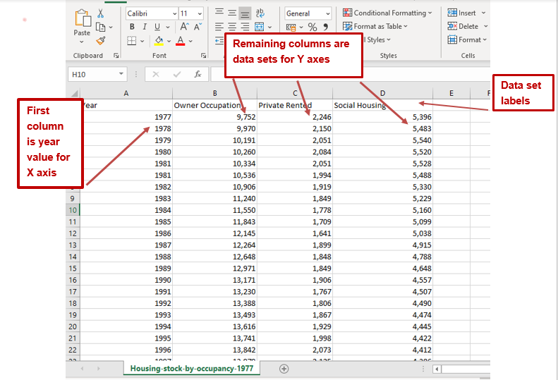
Data – upload the .csv file containing the data as a media asset. The top row must contain the data set labels. The first column must be the X (horizontal) axis values, representing years.
Each remaining column represents a data set for the Y (vertical) axis. A maximum of four data sets can be added to the Y axis.
Note: the key will auto-populate from the .csv file.
Graph description – this will be used as alt text for the graph for people using screen readers and should describe what the image is (e.g. a line graph showing the number of children in temporary accommodation over time, from 2014 to 2023)
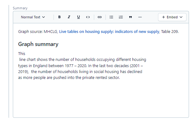
Graph summary – write two to three sentences summarising what the line graph is showing. Keep it simple and clear, illustrating time changes and comparisons in your graph. People using assistive technology rely on this summary to understand the graph, along with users who don’t have time to review the graph itself. Best practice is to write your graph summary so it can be understood when taken out of its original context.
In your summary, remember to include the graph source. You can embed a link to the original source.

10. Line colour - sets the colour of each line by typing the colour and hitting Enter.

If no colours are provided defaults will be used. The order of the colours relates to the order of the data sets in the .csv file. You can drag the colour labels from left to right to change the colour of the line/s.
The allowed colours are:
red,
pink,
blue,
black
(Below are colours relating to political parties that should only be used in that context)
labour,
conservative,
libdem,
greenparty
11. Add component to your page
