Imagery
Introduction
Everything we do is about people. Our photography needs to tell their stories, capture authentic moments,
feel intimate and illustrate the impact of the housing emergency.
You must depict people’s strength, power, resilience and personality. You must avoid clichés, ‘sad’ or ‘depressed’ poses, or anything that victimises your model.
Our imagery is a core part of our identity and reflects the three characteristics of our personality: provocative, proactive and protective.
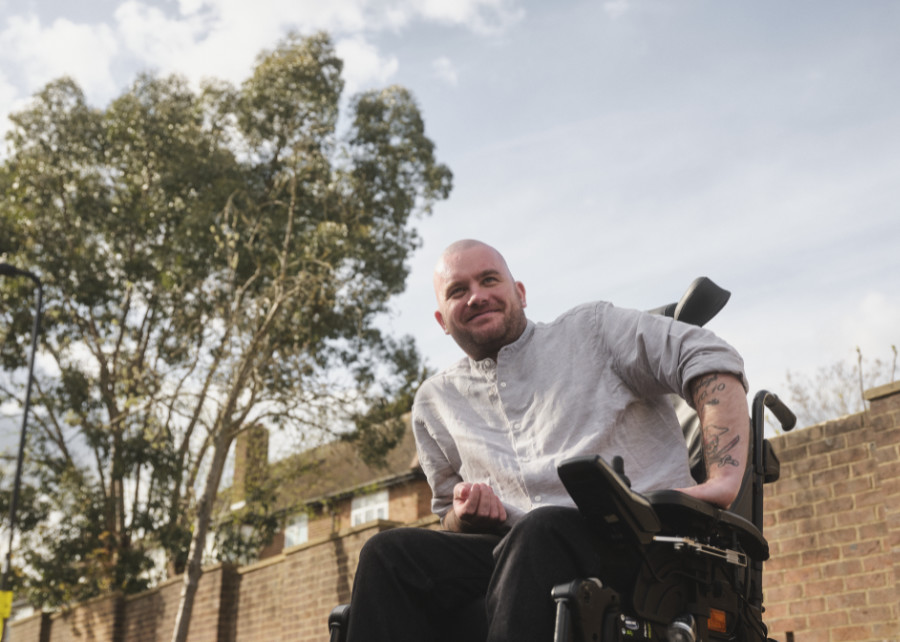
Provocative: imagery that shows the impact of the housing emergency on people’s lives:
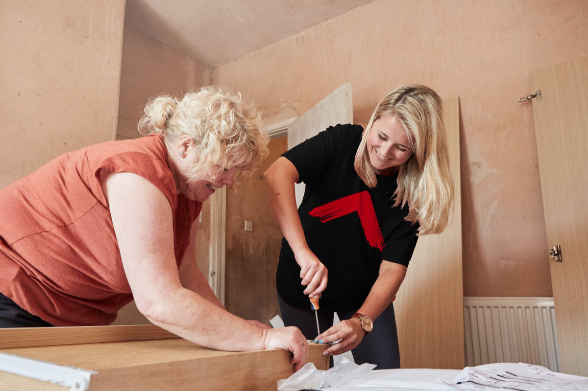
Proactive: imagery that shows the work we do to help communities and create change:
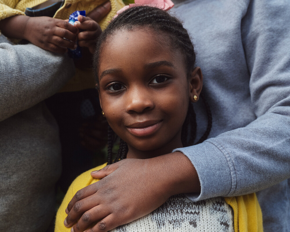
Protective: imagery that shows the human benefit of defending the right to a safe home:
Art direction
By your side/IN YOUR FACE
Our imagery is ‘shot from the hip’. We’re on the ground, among the action, creating positive disruption.
As a starting point, use the idea of ‘By your side’ or ‘IN YOUR FACE’ as a cue for your art direction.
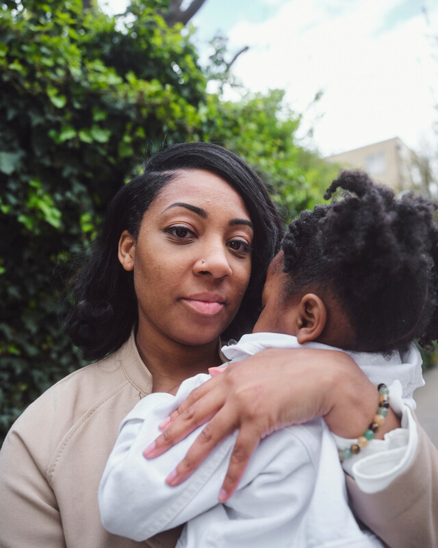
You could use our ‘By your side’ style to capture tender moments and ‘IN YOUR FACE’ for moments
of strength and resilience – or to confront your viewer.
Techniques
You can use a number of techniques to support this style.
These include:
use of space
unexpected compositions
depth of field
colour and lighting
By your side
IN YOUR FACE
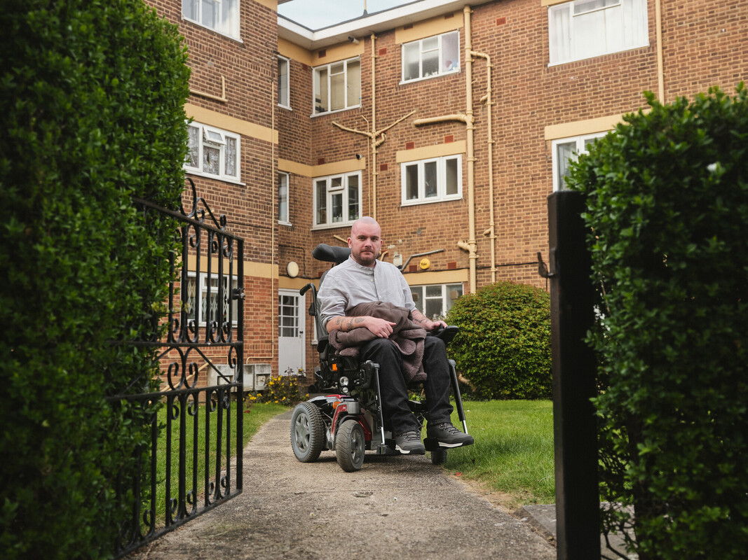
Use of space
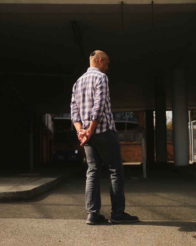
Make use of space – it creates a stronger sense of focus on your model or subject, and it brings harmony and balance to an image.
Prioritising space can help to show the relationship between people and their environment. It also helps to
capture atmosphere and context.
In film sequences
Show the life and texture of the environment: the view from a window in a wide shot, the small details, the green leaves of a plant on the window sill, the streetlight outside.
Use film and sound design to bring out textures and detail to describe someone’s environment. Diegetic and tactile sound heighten the sense of realism in a scene.
For more about our brand in film productions, read our video guides.
Paint brush assets
Using space in your compositions also helps our red paint brush assets to stand out when used with images or in film. Read our guidelines for moving images.
Unexpected compositions
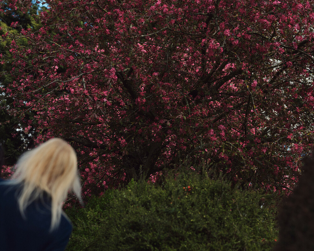
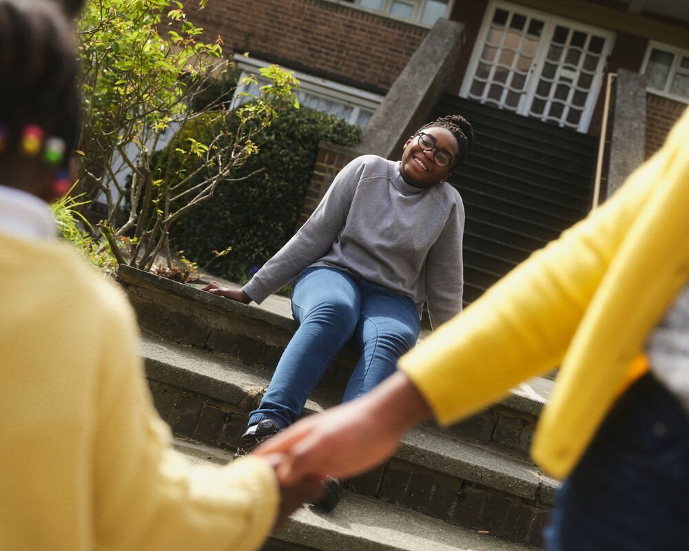
Unusual crops and angles can add to a sense of ‘being there’, connecting the viewer to the model’s story.
You can also use them to provoke and engage. Especially when depicting uncomfortable truths and busier environments.
In film sequences
Your composition guides your viewer’s attention. Use it to direct them to a single person among a crowd, or use a POV shot to place them in someone else’s shoes.
Getting composition right is crucial to conveying subtext and the right information. By controlling angles and distance between people or the space they’re in, you can show your audience the deeper meaning of a scene. Read our guidelines for moving images.
Depth of field
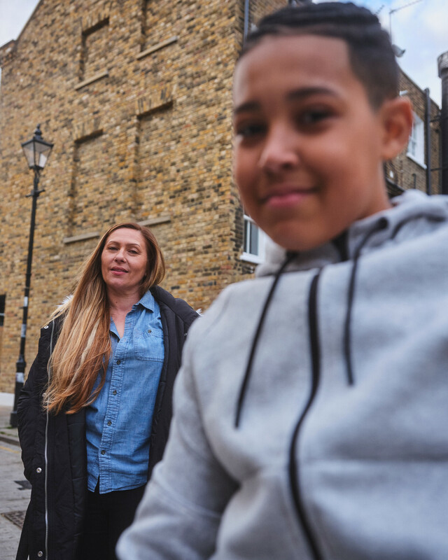
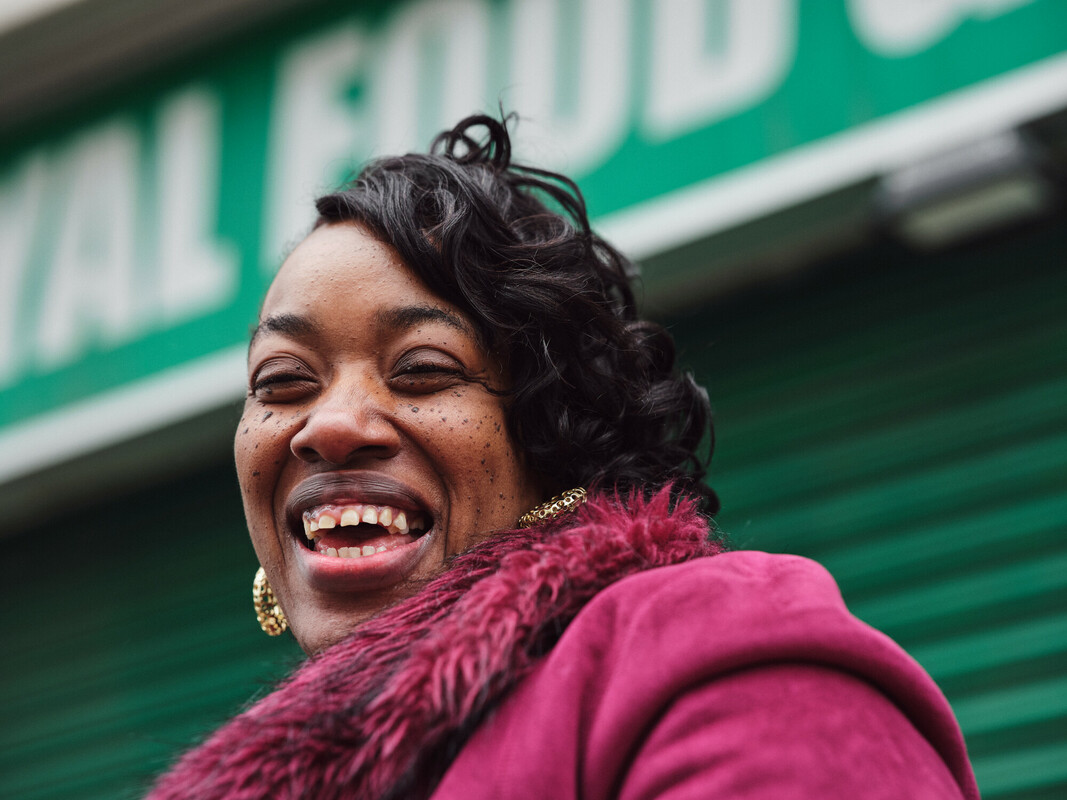
Depth creates a sense of being close to a person – drawing the viewer into their story.
Use it to create a feeling of comfort, closeness and warmth. It’s a great device for capturing private moments at home.
But as you can see below, you can also use depth of field to create a sense of movement and action.
In film sequences
Pull focus to direct the attention of your audience. This’ll create tension in your story and emphasise the action of one person over another. For more, see our guidelines for moving images.
Paint brush assets
Using depth of field also helps our red paint brush assets to focus on the subject they are intervening with when used with imagery or in film.
Colour and lighting
Use muted, calm and natural tones. Avoid overly vivid colours. This gives a real, honest feel to our images.
Styling
If you’re styling a photo or film shoot, opt for muted, neutral tones for clothing and props. Wherever
possible, remove any unnecessary items that are overly vivid in colour from your set.
Lighting
Capture images with a high dynamic range of light and dark. Look for light sources. For example, a warm night lamp, the shadow over a person’s face, or light cast on the side of a wall.
All of this adds atmosphere and helps to create the feeling of ‘being there’.
Paint brush assets
A slight desaturation in colour helps our red paint brush assets to really pop when used with imagery or in film.
Black and white
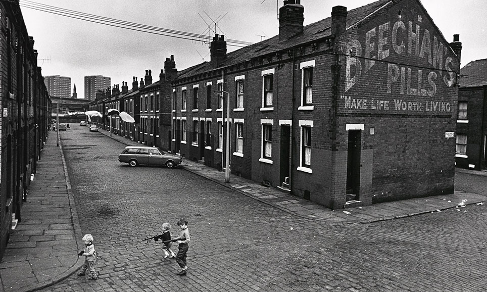
Colour photography should always be our first choice. It’s important for a real and human feel.
Black and white photography should only be used in exceptional circumstances when there is clear
reason – for example, archive photography, or when black and white images are core to a
campaign objective.
Make sure you agree a black and white approach with the Marketing team at the briefing stage.
Content
Our photography should always follow the house style, and use at least one of our art direction cues and techniques.
Diversity
Our photography needs to tell the full story of who we are and the people we help. When you need models for a photoshoot, take care to reflect the diversity of the people we’re fighting for and alongside.
Dos and don’ts
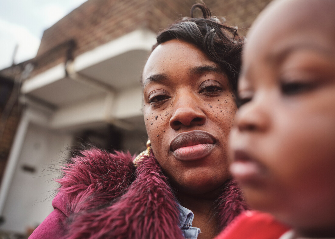
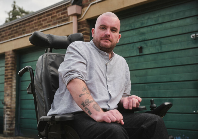
Do add a sense of depth. Create a natural feel and sense of closeness with your model.
Don’t use flat images. Don’t compose images without depth.
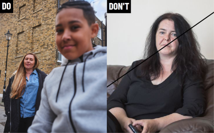
Do use space creatively. Show a clear focal point and create atmosphere.
Don't use unclear focal points. Don’t capture images with poor compositions and no clear focal point.
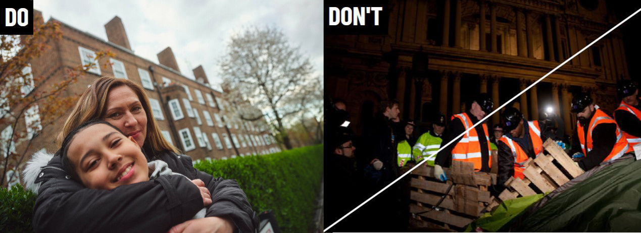
Do find unexpected compositions – look for interesting crops and angles.
Don't use uninteresting compositions – don't create images that aren’t engaging.
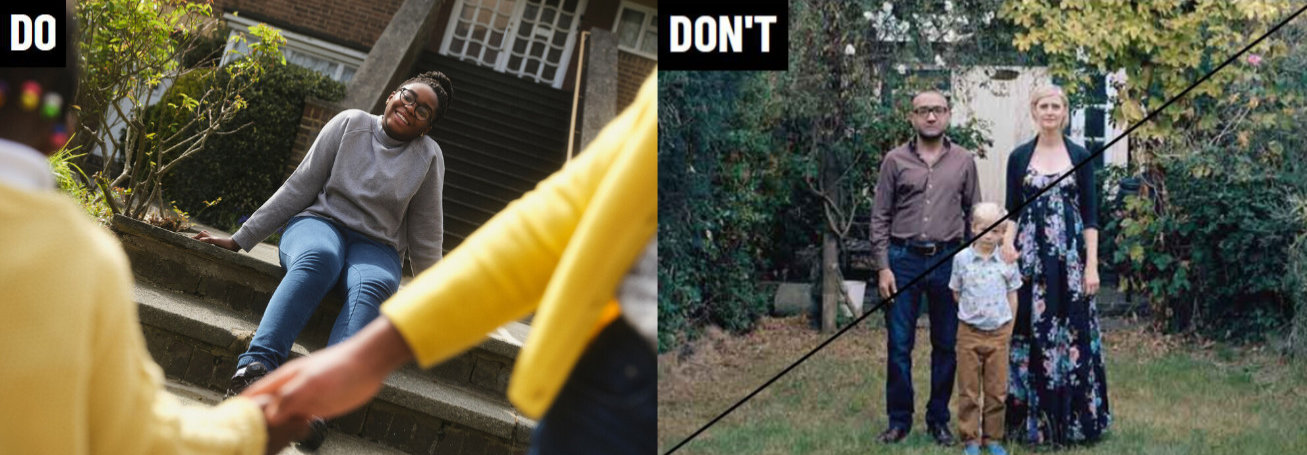
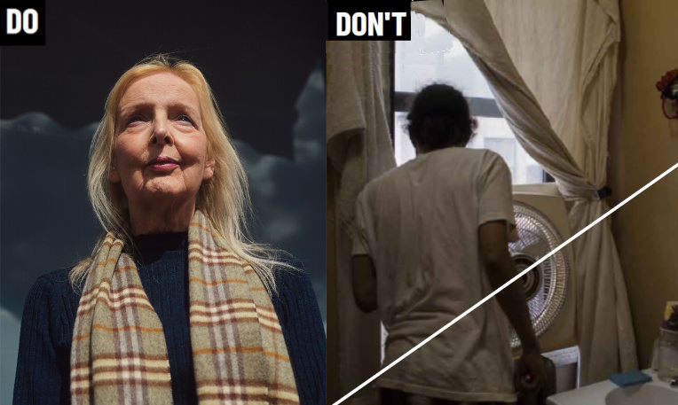
Do capture light and dark – look for sources of light and shadow.
Don't use dark images – don't capture images that are made up of mostly midtones.
Post-production
If you need to, you can adjust the saturation of photographs.
If the colouring is too vivid, tweak this in post-production. All your images should have a slightly muted, natural feel.
This is how to do it:
Open your image in Photoshop
Select ‘Image’ on the menu bar. Go to ‘Adjustments' > 'Hue/Saturation’ (or use the shortcut in the layers panel)
Lower the saturation to the necessary level to create natural tones
Always desaturate an image if it is overly vivid – our imagery should have a slightly muted, natural feel.
Avoid reducing the saturation by too much – this can make your image look grey.
Always create consistent imagery – our images should have a consistent natural feel.
Avoid inconsistent post-production adjustments – colour intensity can vary between different imagery.
Therefore, we adjust each image carefully.
Inspiration
For inspiration, you can explore a number of photographers who use depth of field, unexpected compositions, space, colour and lighting effectively.
Take a look at:
Edward Thompson:
Alex Webb:
Vicky Grout:
Tom Hull:
Questions about use of our images?
Contact the Shelter brand team
