

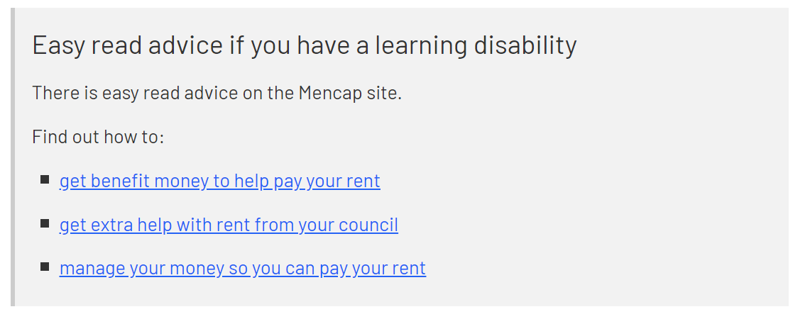
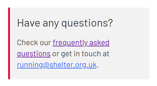
Callouts are useful to create focus on important points, break up long text and give links more prominence. They can even contain an image.
To create one
-
Use Add entry and select Component – Inline callout
-
Type – defaults to ‘Standard’, choose ‘webchat’ if you want to add webchat icon and formatting
-
Content – the rich text editor (RTE) gives you a few formatting options: normal text, H3, H4, bold/italic, bulleted/numbered lists, and hyperlinks. Use embed asset to add an image.
-
Icon – choose an icon if appropriate (phone, map marker, speech bubble etc). Please note that the Central Digital UX team advises to use these sparingly e.g. for webchat callouts.
-
Border Colour – choose from Red, Grey, Warning or Quick Exit. Read more about which colour to use when in the design system.
-
Remove margin bottom – select ‘Yes’ if you want to remove the 40-pixel white space underneath your callout
-
Banner colour – choose from white, grey or transparent (for use within other content blocks that have non-white backgrounds). Grey will be used by default.
When you're ready, Publish the component.
Any questions? Email Lindsay Foley in the Central Digital team.