Writing accessible content
Every skill that goes into producing digital content can improve its accessibility for the 13.7 million people in the UK with disabilities. Content design and editorial come with their own set of best practices, explained in this guide.
Writing for social media? Read our guide to making it accessible.
What is accessibility?
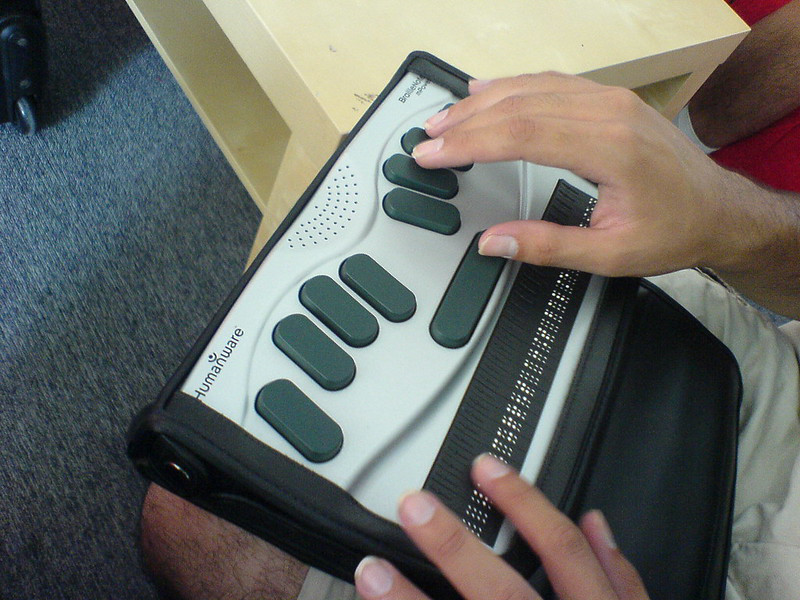
It is the inclusive practice of ensuring there are no barriers that prevent interaction with, or access to, websites by people with disabilities including:
auditory
cognitive
neurological
physical
speech
visual
Accessibility should not be an add-on when your product, service or content is completed. It needs to be considered at the start of the project, with team-members feeling empowered and equipped to build accessibility into their work plan.
Read Shelter’s comprehensive Shelter’s accessibility guidance & best practices, covering the broader context and legal requirements, processes, tools and resources for fully meeting accessibility standards.
Writing in plain language
Write at the lowest appropriate reading level for your content. This doesn’t mean you have to over-simplify your content, but rather try to write so the broadest audience possible can understand you.
See 3.1.5 for guidance on writing in clear and simple language. This criteria is not mandatory but it’s good to aim for
Avoid unusual words, phrases, jargon and idioms as much as possible. If you need to use an unusual word or phrase, explain it to users by showing the meaning in the text, linking to a glossary, or with a footnote. See 3.1.3.
There’s some flexibility to this depending on the audience you’re writing for but remember that when you use unnecessarily complex language, you’re excluding certain groups of people from accessing your content. In fact, writing in plain English is part of our guide to writing online content.
Avoid using acronyms or abbreviations – when they must be used, be sure to explain the acronym in text, link to a glossary, or with a footnote. See. 3.1.4.
Using headings
Clear and informative headings make content easier to understand and more accessible. See 2.4.6 and 2.4.10.
Headings help break up large blocks of content and make text more scannable. Headings should be:
clear and descriptive: avoid mysterious or ambiguous statements or questions
present for every new section of content (a section being a portion of context that deals with one more related topics or thoughts
designated by HTML tags (H1 – H6), starting with H1 as the titles and continuing sequentially (e.g. 1 – 2 – 3)
Writing accessible instructions
Users with sensory disabilities may struggle to understand instructions if they only use one of their senses. See 1.3.3. For example:
‘Press the green button’ wouldn’t be suitable for a user with colour-blindness
To get around this, always use more than one sense for instructions. For example:
‘Press the green Submit button on the right’
Writing accessible hyperlinks
Hyperlinks should be clear and easy to understand – the text of the link should make it clear where it’s going to lead. See 2.4.4.
For example: ‘For more housing information click here’ vs ‘Get more housing information’
The most accessible links are those for which the destination is clear from the link text alone.
Writing accessible page titles
The page title is the what appears in the very top of a browser window. See 2.4.2.
A good, accessible title tells your users which page they are on and what that page is for. The best test for this is whether the title makes sense out of context.
Providing alternatives for non-text content
We should always provide accessible alternatives for non-text content (such as images) that provide the same information for users. See.1.1.1. In practice, this means:
Add a text alternative (alt text) to all of your images. This alt text should give the user the same information that the image conveys, and not just be a description of it.
Add a name to all of your controls. Any buttons should have a name, such as ‘Search’ or ‘Submit’ – so not just an arrow or icon.
Making sure multi-media content is accessible

If you’re working with multi-media content, there are a few things you must do to ensure that it’s accessible:
Flashing content. Make sure pages don’t contain anything that flashes more than three times in one second. See 2.3.2
Pausing, stopping and hiding moving info. The user should be able to pause, stop and hide any moving, blinking or scrolling information that starts automatically and lasts more than five seconds. See 2.2.2
Other accessibility guides
Related
Read our other content guides
Read our brand guidelines
Contact us
Have a question or comment about accessibility or other digital topic? Found a bug? Or maybe you’d like to contribute to the framework? Use our contact form to get in touch.