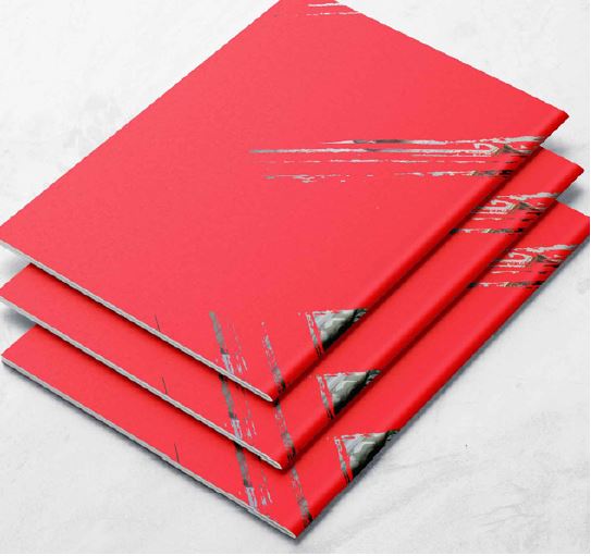
Brush graphics
Graphic library
Always use our brush graphics with purpose. Use them to intervene with typography and imagery, or to add emphasis to words and statements. But do make sure you use them sparingly.
When designing any communications, aim to use minimal brush graphics, for maximum impact.
For one pagers (adverts etc.), only use one brush asset unless you need to use more than one of the same kind of graphic (for example, a set of lines to redact a message).
For longer form communications (web pages, brochure spreads etc.) you can use more than one, but we recommend not repeating the same identical asset.
Colour
Only use our brush graphics in Shelter Red, unless you're using them to treat imagery or in monotone print.
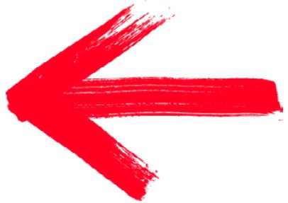
Arrows

Lines
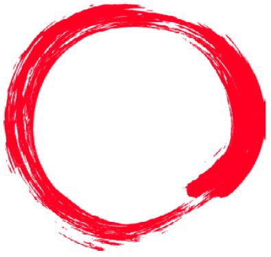
Circles

Ovals
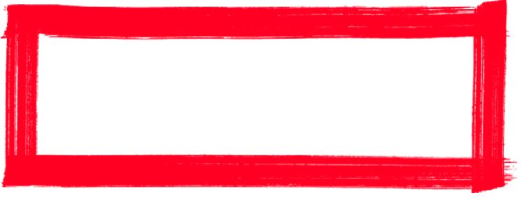
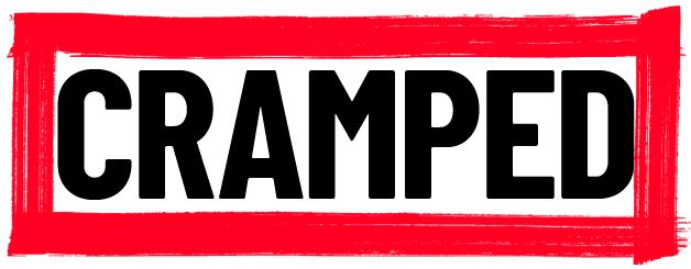
Rectangles

Squares

Crosses
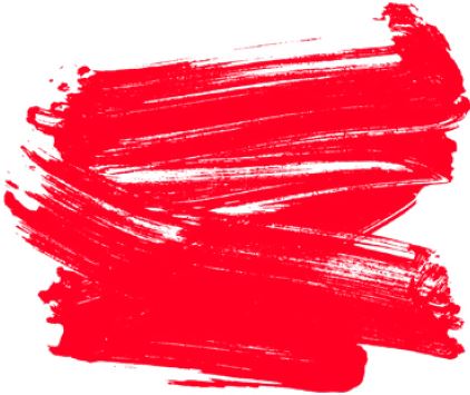
Scribbles
Brush interventions: with type
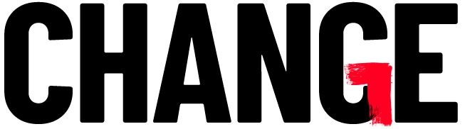
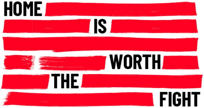
We fight for people. We get laws changed and rules rewritten – we use our brush graphics to represent us. We redact and amend typography to change stories from something negative to positive.
When we make brush interventions with type we try to:
make the messaging relevant to the work we do
only use one type of brush graphic. For example, we don't mix a line and a circle within the same intervention, but we could use multiple lines.
add or emphasise the meaning of words – avoiding decorative use of our brush graphics. Underlining words is technically on-brand, but should be done cautiously as this style is less ownable and may appear
generic. If you're going to underline, think conceptually: e.g. you could underline only one part of the word to add or emphasise its meaningavoid basic interventions. Simply redacting an 'S' at the end of a word isn't purposeful enough
Brush intervention: make it relevant to the work we do
Brush intervention: add or emphasise the meaning of words
Brush intervention: redacting type
Brush intervention: amend a word (avoiding a basic intervention)
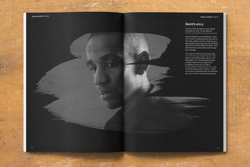
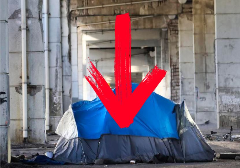
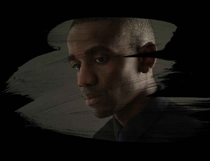
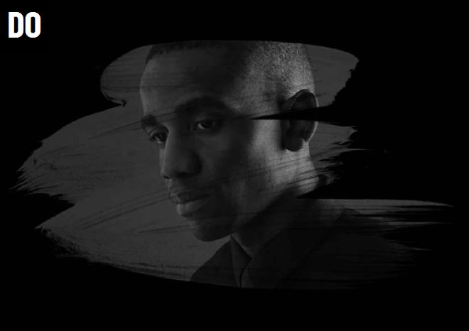
Brush intervention: with imagery
The work we do has a dramatic impact and we can use our brush graphics to help show our causes and tell our stories when we intervene with imagery.
Our assets can be used within imagery to illustrate specific points, tell stories, show our support, highlight causes, have an opinion and ask questions.
We can be large and loud, or small and quiet, but the technique should be used to communicate our roles of supporting (by your side) or confronting (IN YOUR FACE).
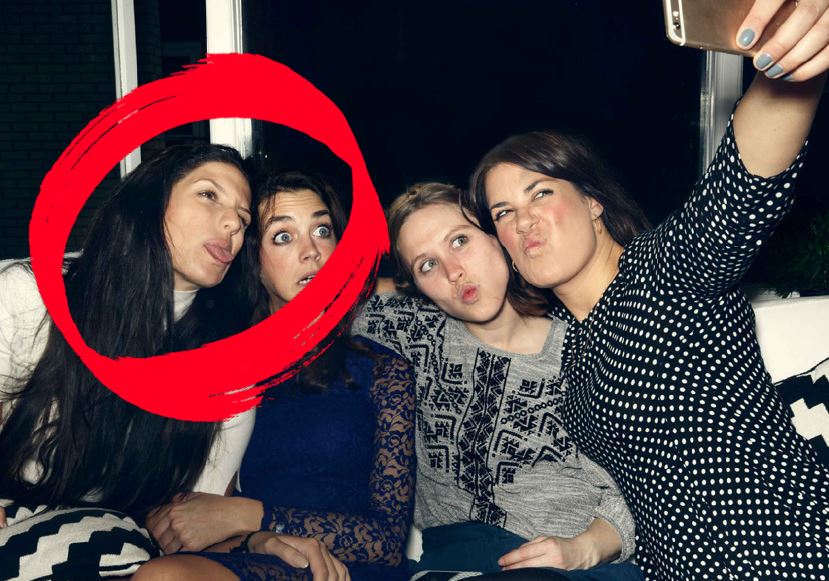
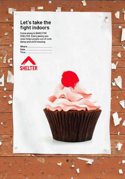
Brush intervention: with cut-out imagery
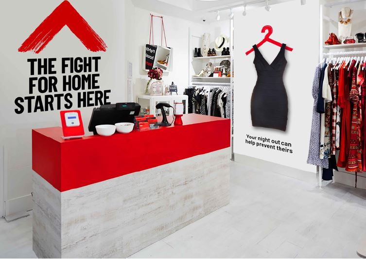
Our positive impact can also be shown in a more playful style by using brush graphics to intervene with cut-out imagery.
The red brush stroke should add something positive to the image. A cardboard box – a symbol of rough sleeping – might become a present, and be used to talk about Christmas donations.
Following this method you can use the brush assets to create infinite examples.
When you make brush interventions with cut-out imagery try to:
make it relevant to our work
add something positive

Bake sale example - using a full stop from our Shelter Activist font adds the finishing touch to a bake sale cupcake.
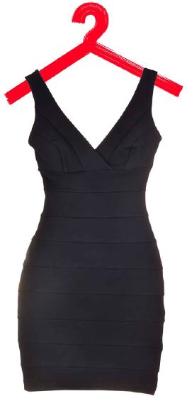
Donation example - custom clothes hanger brush graphic adds new life to this dress.

Christmas comms example -
brush graphic lines turn a simple box into a present.
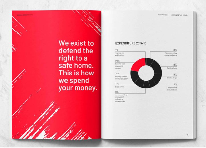
Image treatment
You can use our brush graphics to ‘brand’ imagery. To do this, place images within blocks of brush graphics to frame the subject matter – this makes it ownably ‘Shelter’.
There are two versions of this technique to achieve different levels of brand presence:
The image is placed within the brush stroke, revealing the full effect of the graphic element:
The brush is applied to the edge of the image for a more subtle effect.
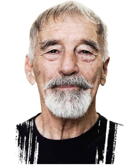
These two techniques are the only instances where the brush strokes don’t need to appear in Shelter Red.
Backgrounds
Our brush graphics can be used as backgrounds, but they must have purpose – we do not use our brush graphics for decoration.
You don’t need do this when you want to add power and emphasis to specific words or statements that
are in the foreground.
To build a brush graphic background, combine multiple brush assets together to create an interesting composition, or you can use one of our 'scribble' assets.
Make sure your composition always looks like a brush stroke and not overly solid red.
Avoid large areas of solid red – the colour red is primarily reserved for our paint brush graphics – and red should only be used with purpose. If you're
making backgrounds, they should look like they're very clearly made from brush strokes, and used for a reason.
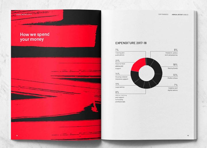
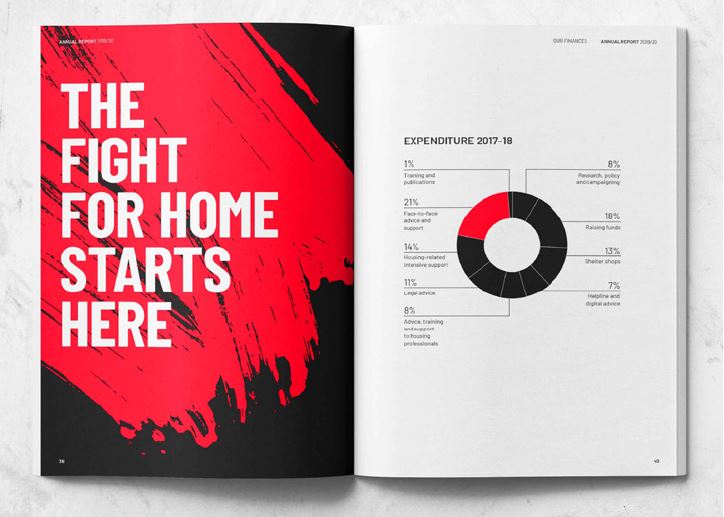
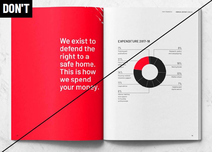
Bush graphic dos and don’ts
Add emphasis to a statement or word -
make a word or statement stand out. Our paint brush assets represent us and our purpose, so whatever you choose to emphasise, make sure it relates to our work.
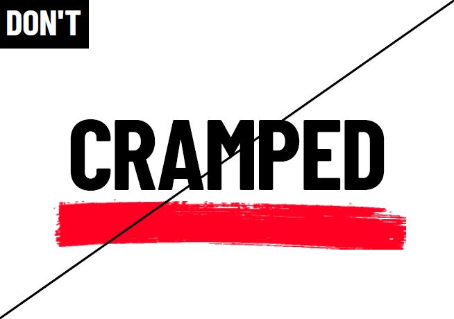
Try to avoid using our brush graphics decoratively - underlining words is technically on-brand, but should be done sparingly and with purpose – as this style can be less ownable
and appear generic.
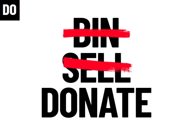
Redact words to create our message - we redact and amend typography to change stories from something negative to positive.
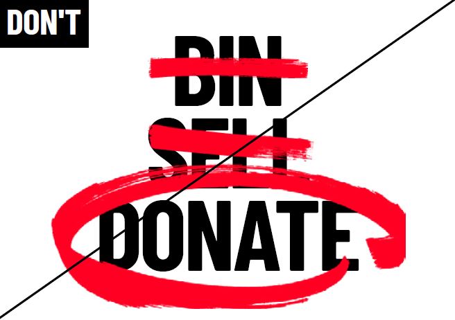
Use one type of bush graphic in an intervention - try to keep it simple. Don't use a variety of brush graphics.
Create interesting brush graphic treatments - where appropriate, place images within brush graphics or affect their edges to make them ownably ‘Shelter’.
Avoid using our symbol as an image treatment - our symbol has purpose and it should follow the roles it’s designed to fill.
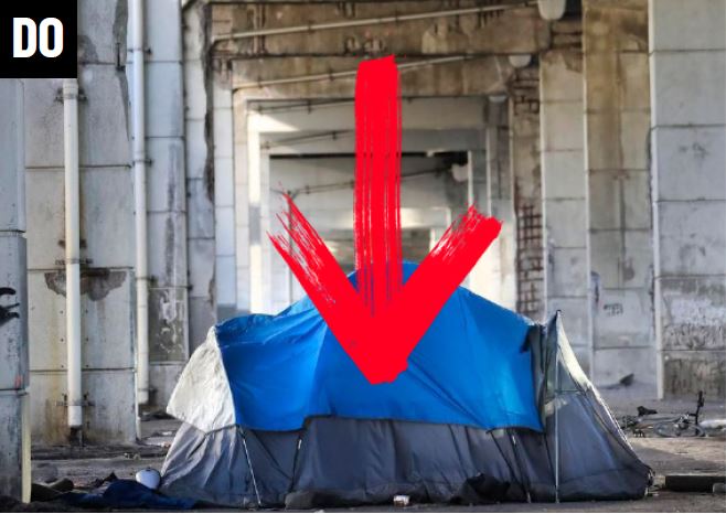
Tell stories with brush interventions - use brush graphics to highlight issues we disagree with.
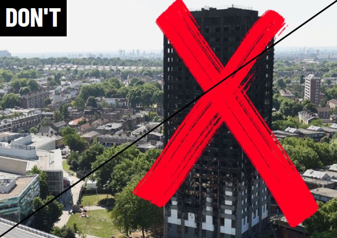
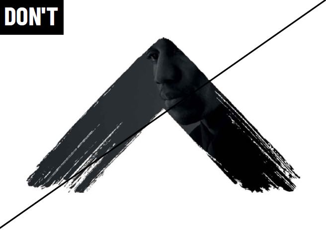
Avoid sensationalising images - be sensitive to your subject matter.
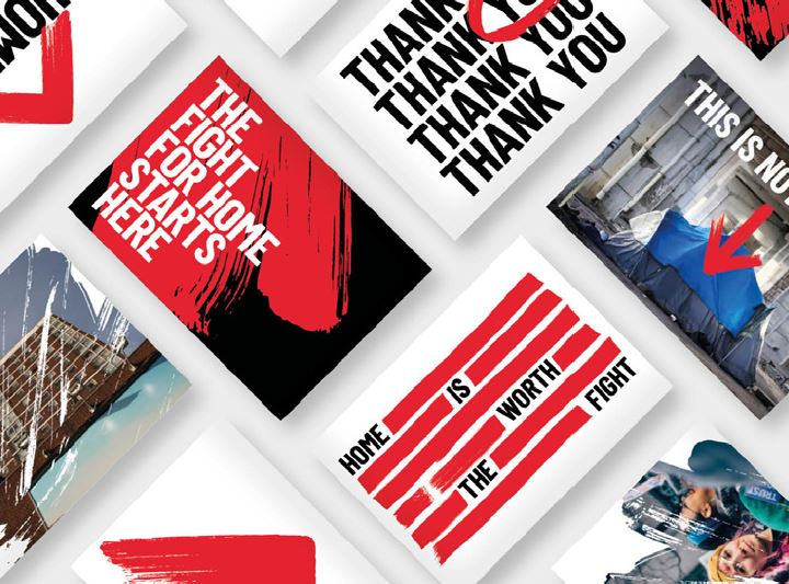
Brush graphics in action