Content card and card link components and banners
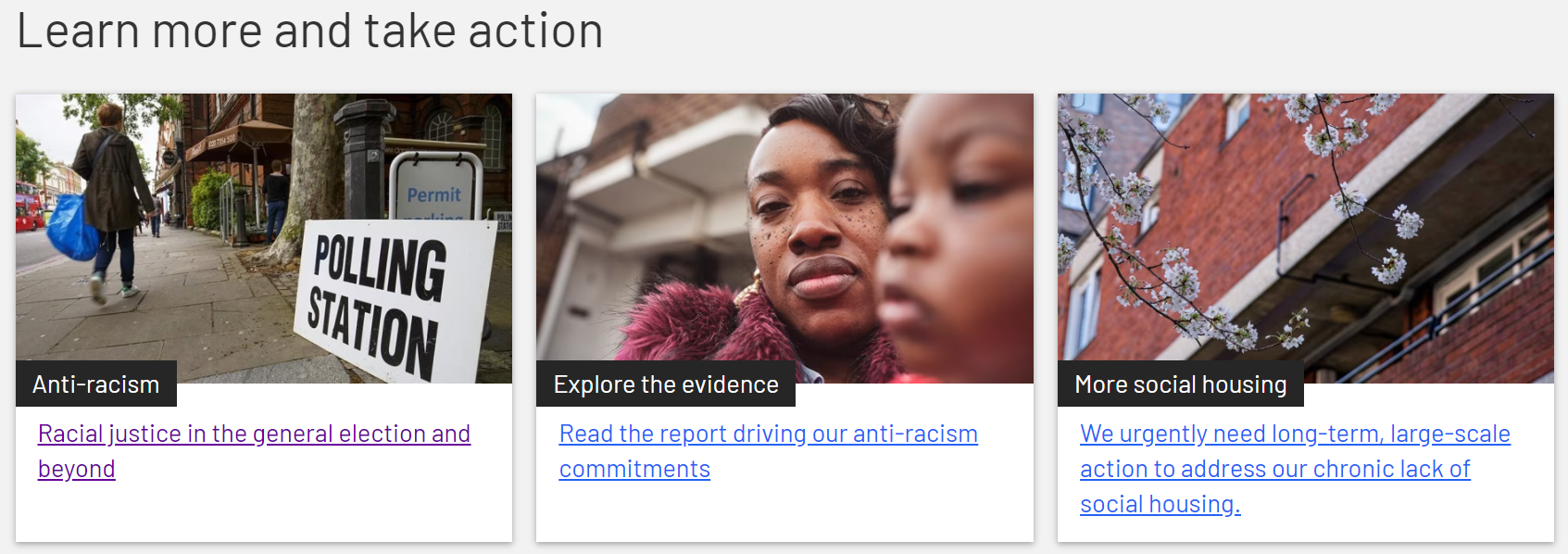
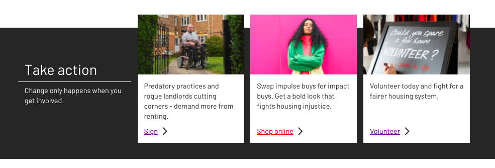
Content cards and Content links are the individual components which promote and link to other pages on our websites. Both Content cards and Content links include an image, label and text description. The entire card is clickable and used with other cards to create either a Content card banner assembly or a Card link assembly.
Content cards in a Content card banner assembly (A)
Card links in a Card link assembly (B)
A) How to create a Content card component
Use Add entry and select Component – Content Card
Title - this creates the label under the image (black box). Keep the character count to 30 or less. The label will stretch to fit the full width of the card, but won’t drop to a second line.
Description – the blue link text at the bottom. You can use up to 256 characters and the card will expand vertically to fit your text.
Link to your destination page. You can link to any page entry in Contentful or an external link component.
Image – create a new image asset or link to an existing one. (Here's the guide to the Media library.) The card image space is landscape: 231x135px on desktop for a 3-across card banner. Contentful will crop your image to fit.
Colour – the label colour defaults to black. Please don’t use any other colour as our current designs call for black labels. If you have any questions about colour choice, contact the Central Digital UX team.
Publish the component
A) Content card banner assembly
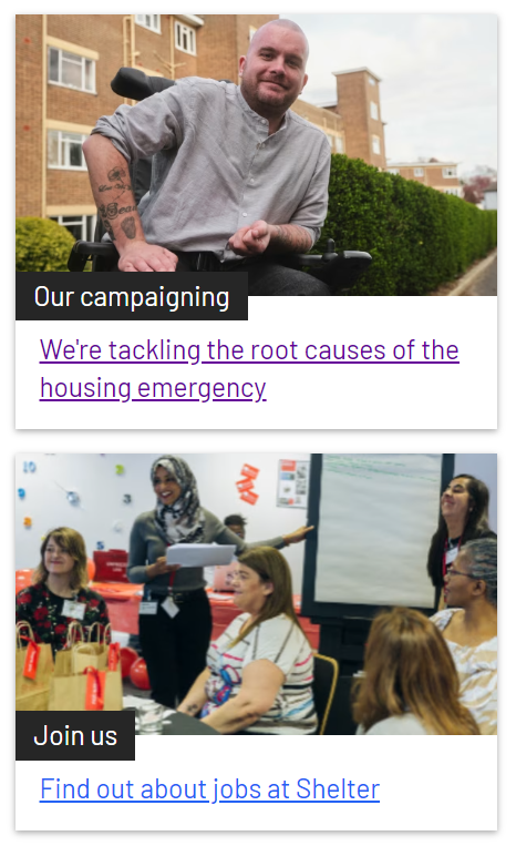
The card banner assembly is extremely versatile. You can:
use it horizontally within full width pages, normally at the bottom of a page to give users ways to extend their journey.
it also can fit our standard 2/3 column width, horizontally, although with three cards it can appear cramped.
use it vertically in the sidebars (righthand sides) of desktop pages – on mobile it will display below the main column content
use it with or without a title (the label)
include a header (optional) that allows for limited formatting: H2 heading, normal text and a link if useful
give it a white or grey background
use 2, 3 or 4 cards - although our standard design pattern calls for 3 cards. When in doubt, ask the Central Digital UX team.
include a 40 pixel margin at the bottom or not
When you’ve reviewed your cards and banner, click Publish.
B) How to create a Card Link component
Use Add entry and select Component – Card link
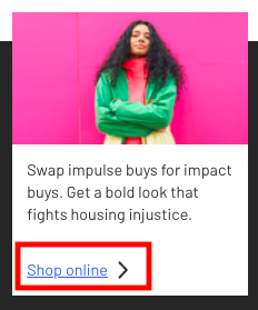
Card image – this is the main image displayed on the card. Create a new image asset or link to an existing one. (Here's the guide to the Media library.)
Card title – this is the main line of text on your card
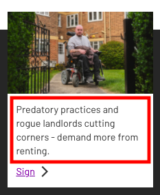
Link – you can link to any page entry in Contentful or an external link component
Link text - add your CTA text
Publish your Card link
Card link banner assembly
This is a horizontal content banner that features three card link components on a dark grey banner. It needs to be used on full width content templates only. You can add a title and some sub-copy that will display in white on the left side of the banner.

Any questions? Email Lindsay Foley in the Central Digital team.
