Forms
There are several variations of pages that use forms. Below you will find a guide on building a basic form. For info on building event forms, sign up forms, and furniture shop forms, see the end of this page.
When building a form, always aim to use existing Component – Form Fields. Most general form fields will already exist in the system (both in a required and optional variant). If you need to add a new Component – Form Field, you will need to ask a developer to do some backend work to make it function correctly within the form reporting.
Building the Assembly – Form
Use Add Entry and select Assembly – Form
Administrative title – this is the internal name for the form and should refer to the page it sits on
Form header – optional if you want to add a title to your form in H2
Background colour – select white or grey
Thank you message – add a message here if you don't intend to redirect to a new page upon submission

Redirect after submission – use this to choose a page you want the form to redirect to after it is submitted e.g. to a thank you page.
Submit call to action – add the text you want to appear on the form's CTA e.g. ‘Sign up’ or ‘Submit’ or ‘Register’
Next you need to add your form fields. Click ‘Add content’ and choose ‘Add existing content’ to find the fields you want to add. You should always aim to reuse existing form fields from within the content library where possible instead of adding new ones.
All generic fields (name, DOB, phone number, email, address, postcode etc) will already be built in both ‘required’ and ‘optional’ variants and so do not need to be re-added to the system.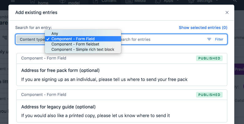
Filter the content type by Component – Form field and search by field name to find each field you need. Choose either the required or optional variant of your field.
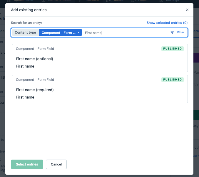
Once you have added all your fields, you can drag and drop to reorder
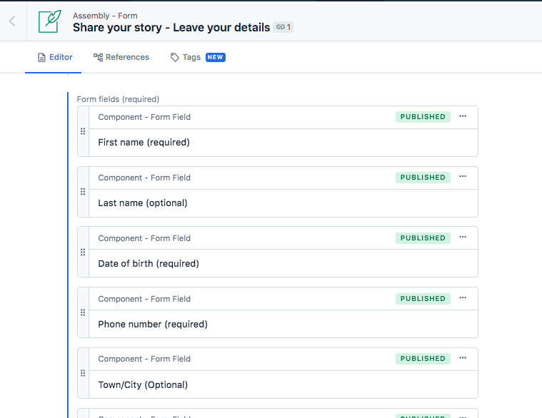
If the form field you require doesn't already exist, you will need to add a new Component – Form field. If you do, a developer will need to do some work to make sure it works correctly in the backend. There is more info on adding a new Component – Form field at the end of this page.
If you need to add any extra sections of copy into your form that do not relate directly to a field, you can do this by selecting Add content > Component - Simple rich text block, and then positioning it where in the form field order you want it to appear.
Show consent - use the toggle to choose whether or not your form displays the consent statement. The options for how people can be contacted displayed in the front end will depend on the form fields. So if your form includes an email field and an address field, people will be given options for whether or not they can be contacted both by email and by post. If you've only got an email field, people will only be able to opt in/out of being contacted by email etc.
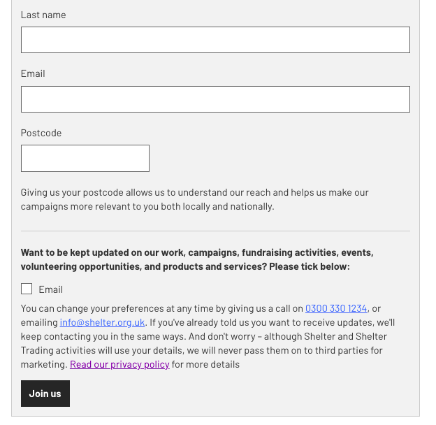
Notification email address – the email of the team who need to be notified every time a form is submitted. This can be left blank if you don't want an individual notification every time a form is submitted.
Thank you email content – here you will need to add a Data – Email. Use this to add the body copy, subject line, sender email and ‘from’ name for the receipt email users will receive after submitting the form.
To add name personalisation to your email body copy, use swirly brackets e.g. {{first_name}}
These names will be taken from the ‘Name’ of the form field you want to use, if changed into snake case (if name field is firstName, the name to use here is first_name).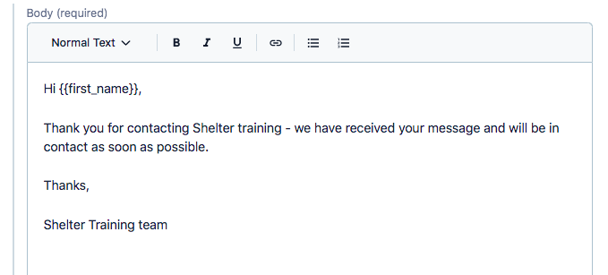
To add a from name for your email, you will need to add the name contained in ““ followed by the email address contained in <> in your From address field. If you do not enter a from name in the from address field, the sender email address will display as the from name.
e.g. “Lindsay - Shelter” <noreply@shelter.org.uk>
Campaign ID – required if sending data to CRM (below)
Send to CRM – defaults to ‘No', select ‘Yes’ if you need the data to be exported to the CRM
Send to Gift Aid inbox – defaults to ‘No’, select ‘Yes’ if this is a Gift Aid form
Go back to your content page and use preview to make sure your form appears as expected
Before publishing, you will need a developer to make sure the form reporting is working in the backend. Always make sure this has been completed before publishing a form.
Building a new Component - Form field
Please only add a new Component – Form field if you have checked that the field doesn't already exist within the content library.
Use Add entry and select Component – Form field
Title – this is the system name seen in Contentful, it should be the title of the field followed by either ‘required’ or ‘optional’ in brackets

Name – this is an internal name that the form report uses to process the data. It should be logical and written in camelCase (so the first word would not be capitalised, but any subsequent word should follow without a space and with a capital letter):

This label needs to be unique to the type of field, but if you're creating a variation of a field that's the same as a pre-existing field, the label would be the same. For example, both optional and required variants of the same field would have the same label. A ‘first name’ field and a field called just ‘name’ could also have the same label as they’re essentially the same and don’t need unique identifiers.
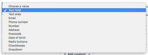
Type - this defines the field type and gives you several options that range from numerics to radio buttons to free text fields
Label – the title for your field that will display on the form
Help text – if you want to add a line of subtext under the field to give users a better understanding of how to fill in their information or encourage them to share information with us
Options – if you have set your form field type to either radio buttons, checkboxes or dropdown, this is where you add the variants
Please check the content library to make sure the option does not already exist before creating a new one. If the options you are adding are generic, it's likely they already exist on other forms (e.g. ‘yes’ or ‘no’). It doesn't matter what type of form field these have been used in, as long as the wording is the same.
If the options don't already exist within the system, choose Add content > Component – Form field options. First you will need to add a Value. For yes or no options these would be true or false. For any other type of option, add a single, logical word (usually the same as the label). You will also need to add a Label, which is the label for the form field option that users will see in the front end.
Default – for dropdowns only. This adds default copy in the dropdown field where it may not be clear that a user needs to click into the field to see options. e.g. ‘Please select’
Field width – for text fields only. This should usually be set to ‘Standard’ although there is an option to make the field display as smaller (e.g. for ‘Title’ or ‘Postcode’
Choose whether the field should be required or optional. This should match the title you gave your form field.
Once you have completed all fields, click publish.
Building a sign up form
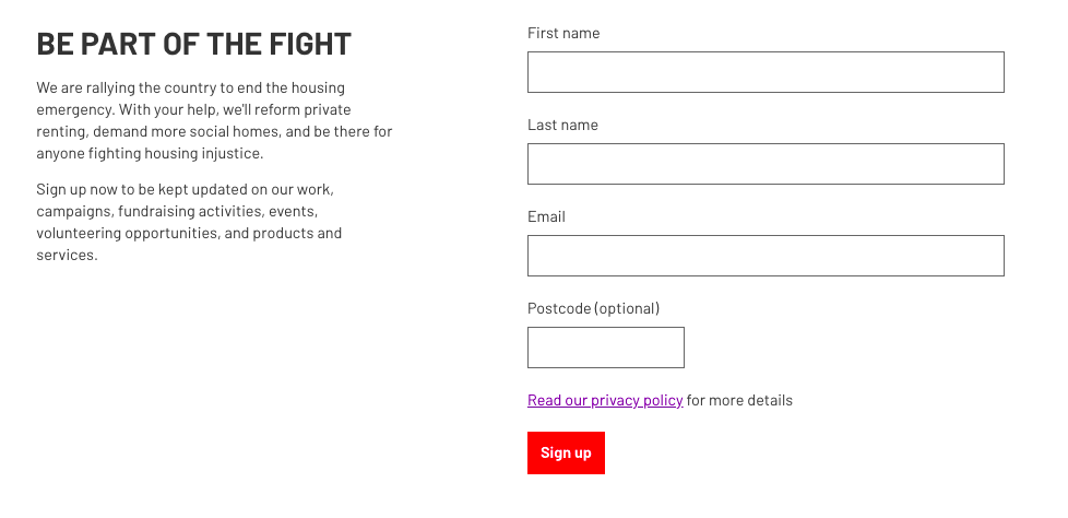
We also have a form type called the Component – Signup form. This uses a normal form assembly to create a form that sits in the right-hand column, with a heading and intro copy in a lefthand column.
You build a form assembly in the usual way and add it into the Component – Signup form.
The resulting form will look something like this:
Building a furniture shop form
To build a new furniture shop form, set the shop type in your Data – Shop to ‘Furniture’. You will then need to build a Page – Shop. More info on building shop pages and data here.
On the Page – Shop, add your form into the Furniture collection form field.

Click Add content > Assembly – Form.
Create a form in the same way we created the form assembly above.
Publish the form and then publish the changes to your page once the backend work to your new form is completed. The ‘Furniture collection form’ banner will automatically be generated on your shop page.
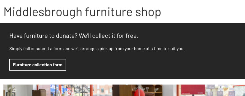
You can also add a phone number to appear in this banner using the ‘Furniture collection phone number’ field in the Data – Shop.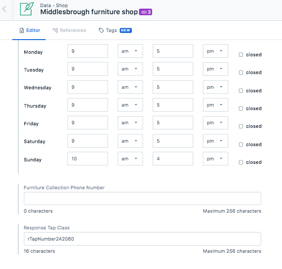
Building an event form
On the Page – Standard Event, you will see three fields: Register interest form, Sign up form, and Waiting list form. You can add a form to any (or all) of these fields.
The status of the event set in your Data – Event will define which form is displayed on the page. So, if the event is set to ‘open’ in the event data, it will display any form added in the page’s ‘Sign up form’ field.

The CTA at the top of the event page will act as a jump link to your form, which will be displayed at the foot of your page.
