Logo
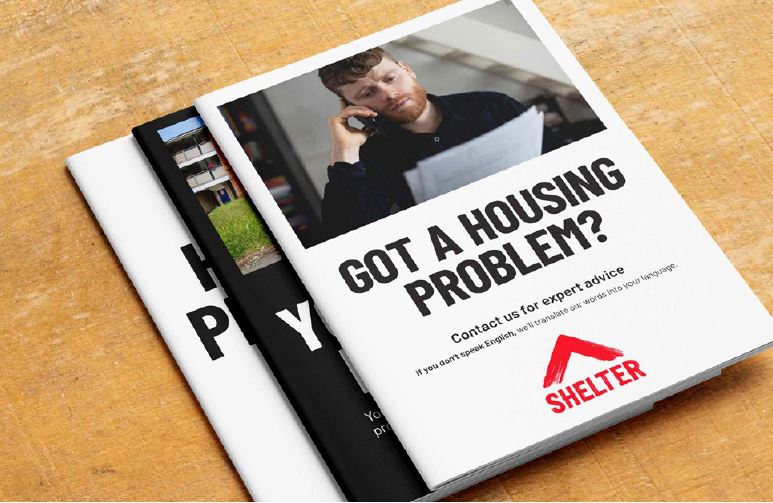
Please don't use any of the photography examples here in your creative work without first checking permissions with Shelter's Marketing team. The majority aren't owned by Shelter and therefore cannot be used.
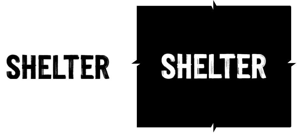
Our logo embodies the energy and power of our organisation. We trust in this mark, so we need to always take care of it.
Our logo is our symbol and wordmark, fixed as a single unit. Keep this union wherever possible, unless you’re using the symbol as the primary graphic element, or in exceptional circumstances like small scale digital applications, e.g. favicons.
Our full logo works across both 'dissatisfied' and 'demanding' roles.
Logo
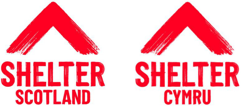
National logos
Logos are available for Scotland and Wales. These logos are only available for use on communications that are specific to that nation. All of the same logo rules apply – including minimum size, clear space and the role of the symbol (see below).
Symbol and wordmark
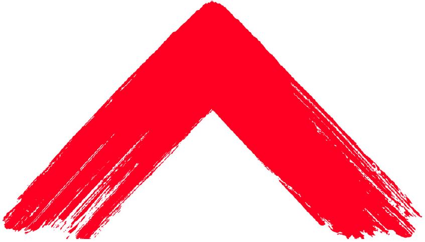
Our logo is also supplied in its two separate elements: the symbol and the wordmark.
We use them separately when the symbol is the primary graphic element in a piece of communication.
In these moments, you can scale up the symbol to a larger size than the wordmark.
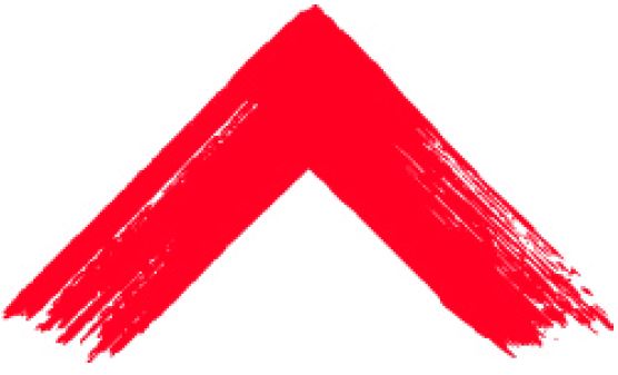
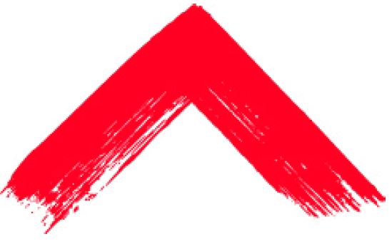
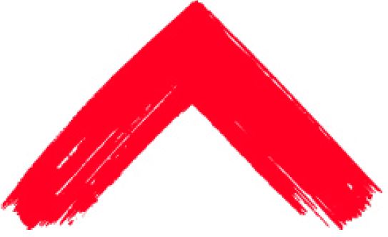
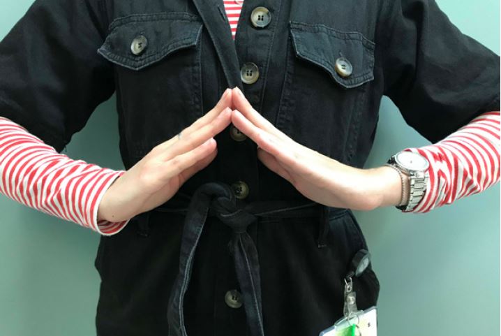
The symbol must always be used pointing up, and never down or sideways.
Our symbol works across the 'dissatisfied', 'demanding' and 'defending' roles.
Symbol:
Wordmark:
In action:
Our symbol should always point up, never down.
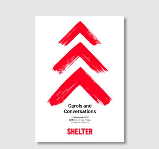
Symbol suite
For communications where the symbol is the hero, we have a suite of symbols. These alternatives add depth and human authenticity.
Remember, the symbols must always be used pointing up, and never down or sideways.
Alternative 1:
Alternative 2:
Alternative 3:
In action:
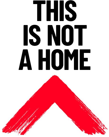
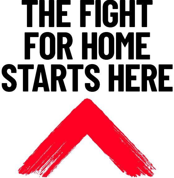
Role of the symbol
Our symbol has three primary roles:
Dissatisfied: to point to a problem or issue that needs to be addressed
Demanding: a point of action to demand that our audience pays attention
Defending: a roof to protect the rights of the people we stand with. Or using it to protect our principles
Our symbol acts across these roles both when used as the primary graphic element, and when seen in our logo. However, our logo doesn’t work as well for the 'defending' role.
Dissatisfied example, symbol:
Demanding example, symbol:
Defending example, symbol:
Dissatisfied example, logo:
Demanding example, logo:
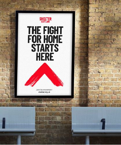
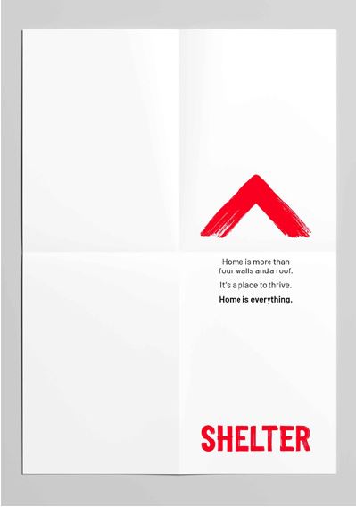
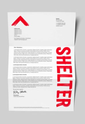
Positioning
Logo
Our logo doesn’t have a fixed position. It can sit wherever feels appropriate to the overall design.
The logo is designed to play an active role within our brand and you should aim to use it with purpose.
It can be used to intervene or point to content, and acts across the 'dissatisfied' and 'demanding' roles.
Where possible, avoid placing it in corners away from other content.
Symbol and wordmark
When the symbol is used as the primary graphic element, you can use it across the 'dissatisfied', 'demanding' and 'defending' roles.
Positioning, logo:
Positioning, symbol:
Positioning, vertical wordmark with symbol:
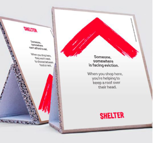
Our brand is flexible – this gives you space to create powerful events ads while still keeping to our core rules.
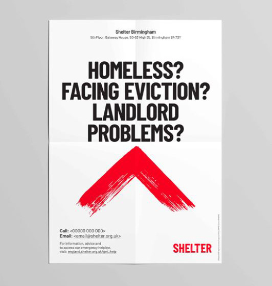
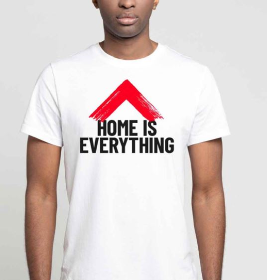
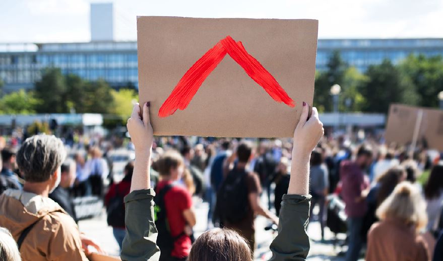
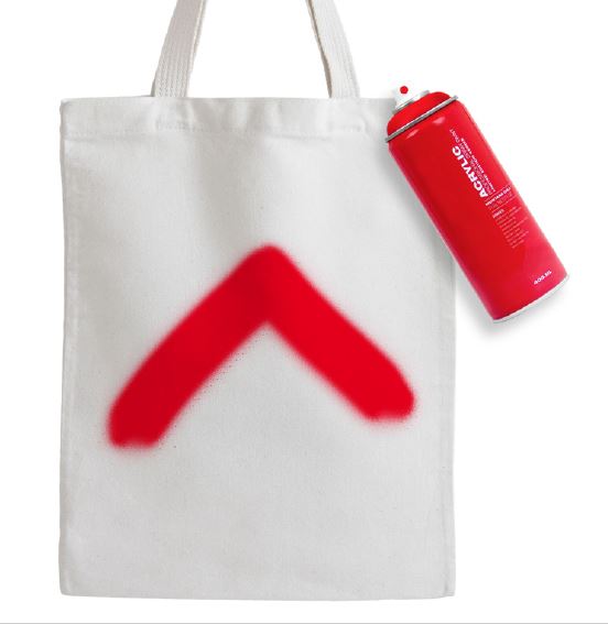
DIY symbol
Our symbol embodies 50 years of campaigning and a never-give-up attitude.
It’s a symbol that people can recreate, make at home, share and ultimately, take to the streets with.
It doesn’t need to be perfect. You can recreate it with pretty much anything – spray, ink, pen, paint,
chalk, lipstick, red tape, brushes, pencils – so long as it’s bright red.
Important
When we encourage others to create and use our symbol, we always do it within the law. When people create, we want them to use their own belongings – homemade signs, t-shirts, bags. We do not condone vandalism.
You can help prevent this by never applying our branding onto objects that might be mistaken for
vandalism. Places like walls, doors and other private or public property.
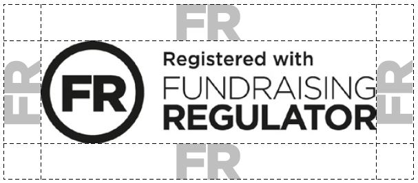
Clear space
Logo and wordmark
When positioned near other elements, our wordmark – whether seen in our logo or when separate – is protected by an exclusion zone.
You should leave a minimum space equal to the ‘S’ at 25% scale all around the four sides of the wordmark.
Remember, this is a minimum clear space rule – if our logo/wordmark looks too close to other design
elements then add more space. As a suggestion, try a clear space equal to the ‘S’ at 50% in these instances.
Our symbol
We don’t apply rules for a minimum clear space to our symbol. This applies whether it’s seen in the logo or used as a primary graphic element.
Logo: minimum clear space – 'S' = wordmark at 25% scale. Our symbol has no minimum clear space rule.
Wordmark: minimum clear space – 'S' = wordmark at 25% scale.
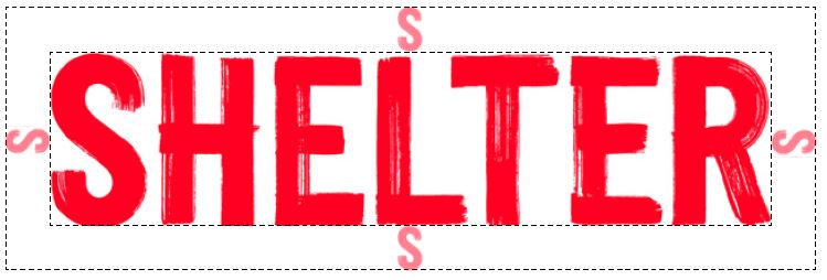
Symbol: no minimum clear space – we ask you to use our symbol with purpose. To achieve the role of our symbol, we don’t use rules for minimum clear space.

Minimum size guide
Remember, there's no maximum size for the logo. Go big, shout if you have to.
Minimum size
The minimum size for the logo is 20mm in print and 80px on digital applications.
A-sizes
Don’t make the logo smaller than the following sizes on standard formats:
A6: 20mm wide
A5: 28mm wide
A4: 40mm wide
A3: 56mm wide
A2: 80mm wide
A1: 114mm wide
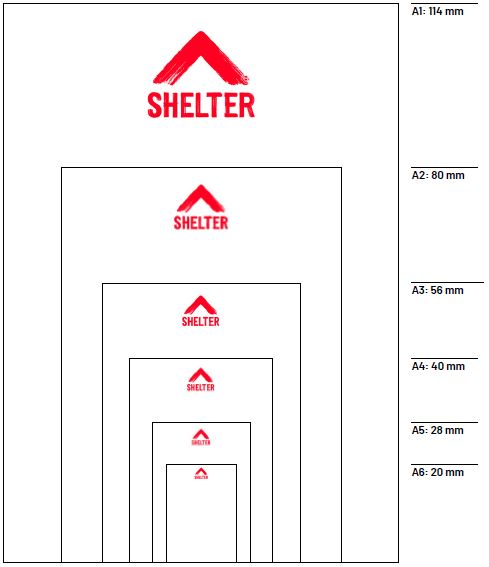
Minimum size guide: for A-sizes – here’s some loose guidance. Our logo system is flexible, the main thing is for logo sizes to reflect their purpose/role.
Remember, there's no maximum size –
we’ve given you a steer for minimum size but we recommend thinking big.
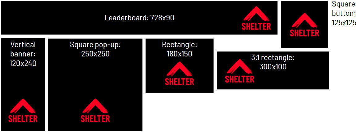
Digital communication
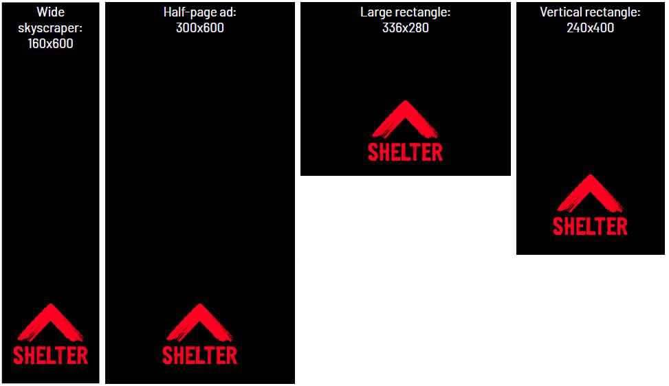
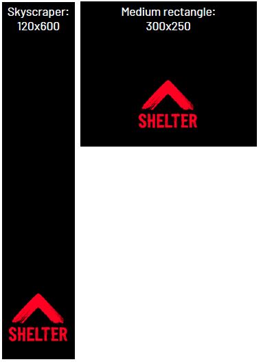
Don't use the logo smaller than the following sizes on standard digital formats:
Leaderboard: 80px wide
Full banner: N/A*
Half banner: N/A*
Skyscraper: 90px wide
Wide skyscraper: 120px wide
Half-page ad: 120px wide
Vertical banner: 80px wide
Rectangle: 80px wide
Vertical rectangle: 120px wide
3:1 rectangle: 80px wide
Medium rectangle: 90px wide
Large rectangle: 120px wide
Square button: 80px wide
Square pop-up: 80px wide
Pop-under: 120px wide
Remember, these are minimum sizes. You can make the logo bigger if it suits your design and keeps
within the logo's clear space rule.
*Our logo can’t sit on these formats. This is because it would need to go smaller that it's minimum size –
80px. On these formats, use our symbol and wordmark.
Minimum size guide: logo at 80px wide:
Minimum size guide: N/A* (use symbol and wordmark):

Minimum size guide: logo at 120px wide:

Minimum size guide: logo at 90px wide:
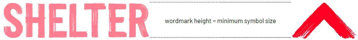
Symbol
The same minimum size guidance on standard formats applies to our wordmark when separated from the logo.
The minimum size of the symbol when separated is determined by the height of the wordmark on your
communication – it should never be smaller than the height of the wordmark.
Remember, these are minimum sizes. You can make the wordmark and symbol bigger if it suits your
design and keeps within the logo's clear space rule.
Minimum symbol size: determined by the height of the wordmark:
Recommended small symbol size, in action:
Recommended small symbol size – try matching the width of the symbol to the width of the wordmark when used at smaller sizes:
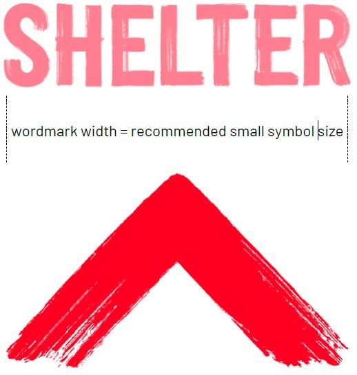
Minimum symbol size, in action:
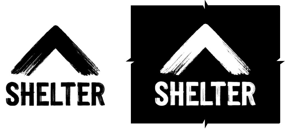
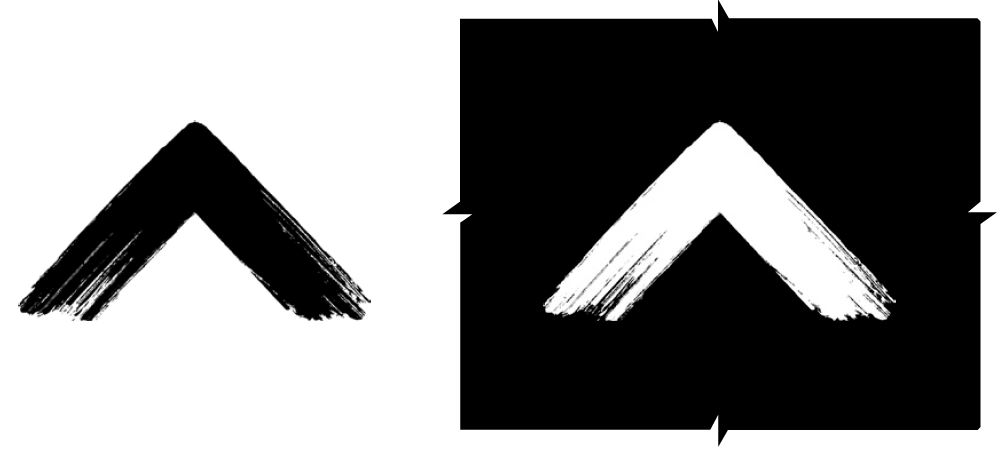
Alternative logos
It's important our logo, symbol and wordmark appear in red wherever possible. In exceptional circumstances, a black or white logo may be used.
This should only be used as a last resort when red doesn’t work, and when the logo exists independent of our other brush assets.
For example, external partnerships using a coloured background that red can't sit on, or in black and white newsprint.
Black and white logos (regional logos also available) – for exceptional circumstances only:
Black and white symbols – for exceptional circumstances only:
Black and white wordmarks (regional wordmarks available) – for exceptional circumstances only:
Small print
Charity details
It’s a legal requirement that our registered charity numbers appear whenever we use our logo. So in every communication you should include the following wording:
©Shelter, the National Campaign for Homeless People Limited 2021. Registered charity in England & Wales (263710) and Scotland (SC002327).
Regulatory details [IMPORTANT]
For all letters, order forms and websites, always show our company information in full.
Please use this wording:
©Shelter, the National Campaign for Homeless People Limited 2021. Company registered in England and Wales (1038133). Registered charity in England & Wales (263710) and Scotland (SC002327). VAT Number 626 5556 24. Registered address 88 Old Street, London, EC1V 9HU.
Photography
If you are using imagery you should credit the photographer in your small print and indicate if the image/s feature models or volunteers, e.g:
Photography by <name>. The person pictured is a model.
Placement
We recommend that the small print should run at the bottom or up the right-hand edge of your materials. Choose the location which best suits your design.
Minimum font size
If space is limited on your piece of communication the minimum font size for small print is 4.5pt, using Barlow Regular. On darker backgrounds use Barlow Semibold at 4.5pt.
Exceptions
In exceptional circumstances our small print may simply not fit onto your piece of communication, or it might not be required, for example on something like a business card. In these instances just check with the project stakeholder/commissioner.
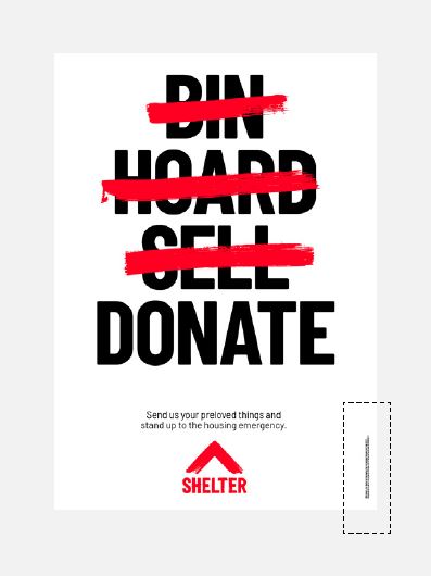
Charity details: example of placement
©Shelter, the National Campaign for Homeless People Limited 2021. Registered charity in England & Wales (263710) and Scotland (SC002327).
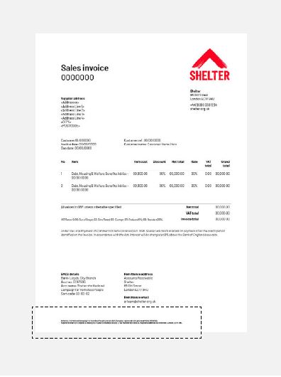
Regulatory details: example of placement
©Shelter, the National Campaign for Homeless People Limited 2021. Company registered in England and Wales (1038133). Registered
charity in England & Wales (263710) and Scotland (SC002327). VAT Number 626 5556 24. Registered address 88 Old Street, London, EC1V 9HU.
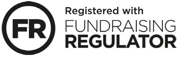
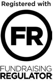
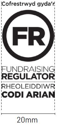
Fundraising regulator
You must always use the Fundraising Regulator logo on any fundraising material that asks the public to donate.
There are two variations you can use, depending on the space within the design – portrait and landscape. If you’re extremely restricted on space (for example, a web banner) then you can reference it within the small print: ‘Registered with the Fundraising Regulator.'
We prefer to use the black and white version of the Fundraising Regulator logo. If needed, there is a colour version you can use.
Primary Fundraising Regulator logo
Secondary Fundraising Regulator logo
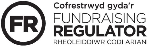
Primary Welsh Fundraising Regulator logo
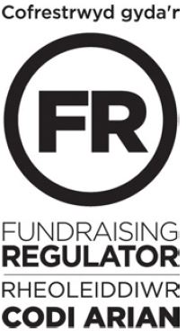
Secondary Welsh Fundraising Regulator logo
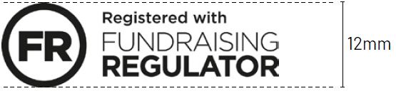
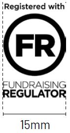
Minimum size
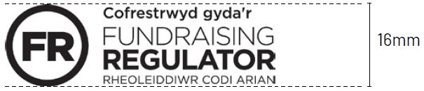
Minimum size
Partnerships
There are three types of partnerships. These have different rules when it comes to using logos and graphics:
Shelter-led – when a communication comes from us
Partner-led – when a communication comes from one of our partners and they want to show that they’re supporting us
Co-branding – when a partner is offering more than just income alone, and we are working together towards a specific goal or campaign
When including a logo to show there’s a partnership on Shelter-led or partner-led communications, make sure you include a description of the nature of that partnership.
Please see below for guidance.
Shelter-led communications:
We use this when we've created a strategic partnership, for instance, running a service or
producing a report together.
We use this when a partner
is funding our work.
Partner-led communications:

Partners use this when we've created a strategic partnership, for instance, running a service or
producing a report together.
Please contact the Corporate team if you need to use this.
Partners use this when they're working with us or fundraising for us.
Please contact the Corporate team or Community Fundraising team if you need to use this.
Individual people or organisations who aren’t in formal partnership with us use this when they’re fundraising.
Please contact the
Community Fundraising
team if you need to use this.
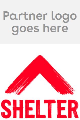
Shelter-led communications
When a communication comes from us, we always use our brand identity and tone of voice.
When we want to celebrate a partner who's helping us to raise vital funds, the partner's logo and a description of how they're working with us are added to the communication.
These can sit in the corner of the page that works best for the design, and are not locked up to our logo.
Sizing
The partner's logo shouldn't be bigger than the Shelter logo or wordmark. When you use a partner’s logo on
our communications, make sure you always check the partner’s logo guidelines.

Partner-led communications
When a communication comes from one of our partners andthey want to show that they're supporting us, it should be in their brand identity.
Our partners must follow our clear space and minimum size guidance when using our logo.
Partner-led poster:
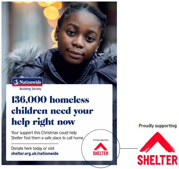
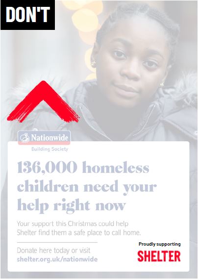
Don’t separate our logo on partner-led communications.
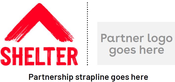
Co-branded communications
Sometimes a partnership might need a logo lock-up.
This only happens when the partner is offering more than just income alone. We must be working together towards a specific goal, or on a campaign.
Position 1
The partner logo is positioned above our logo, so that we're pointing towards and celebrating our partner.
Position 2
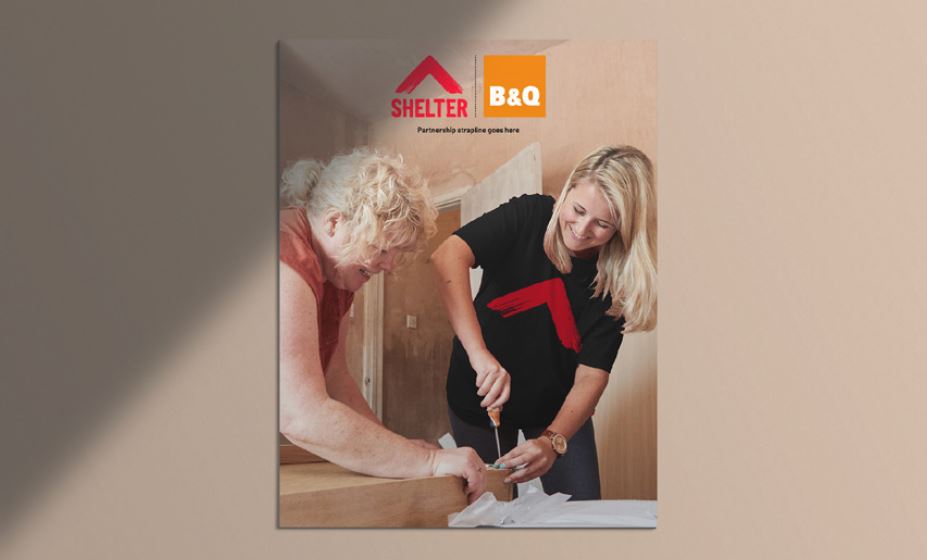
If there's a strapline explaining the partnership, the logos sit side-by-side. A dotted line sits between the two logos.
Please speak with the High Value Partnerships team if you’d like to create a corporate partnership lock-up.

Position 1
Position 2
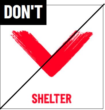
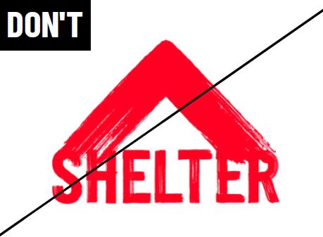
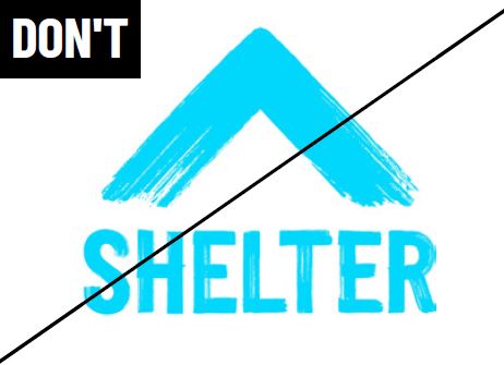
Some major don'ts
Our logo represents us, so give it the respect it deserves. Never recreate, alter or misuse it in any way.
Don’t skew or distort the logo:
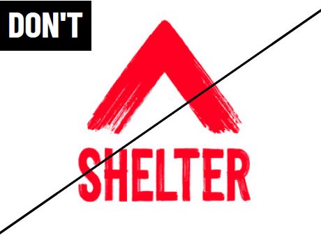
Don’t overlap the symbol and the wordmark:
Don’t change the colour of the logo:
Don’t use on red backgrounds:
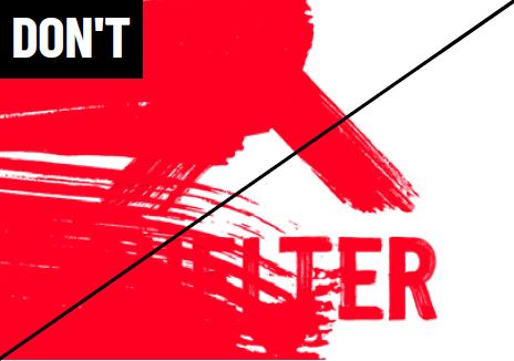
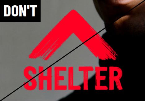
Don’t use over complex areas or images:
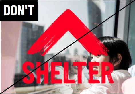
Don’t use over midtoned imagery:
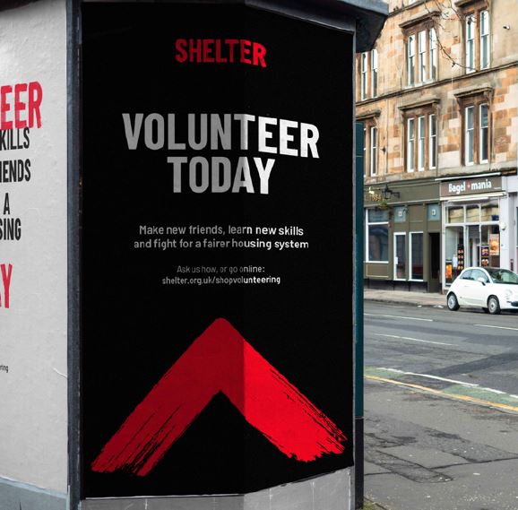
Our logo in action
Questions about use of our logo?
Contact the Shelter brand team