Typography
Learn the typefaces that are part of Shelter’s brand, and how to use them.
Please don't use any of these photography examples for your creative work without first checking permissions with Shelter's Marketing team. The majority aren't owned by Shelter and therefore cannot be used.
We’ve created a human approach to how we speak and use typography.
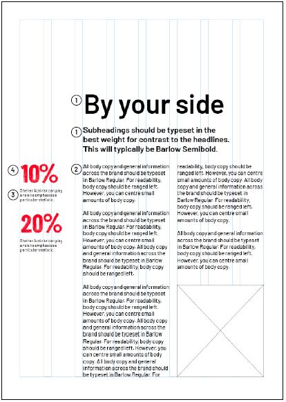
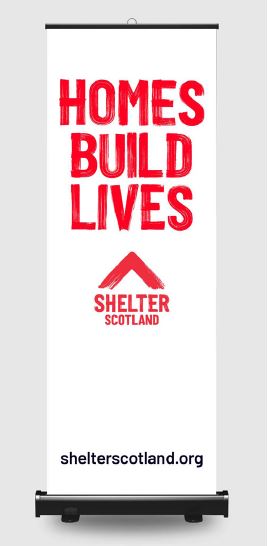
By your side
We use this style across a range of channels to show people we care and we’re ‘By your side’.
To strike this gentler tone, set your text in sentence case and use a smaller font size. We recommend Barlow Extra Light, Regular or Semibold.
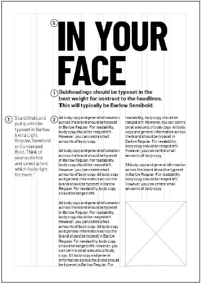
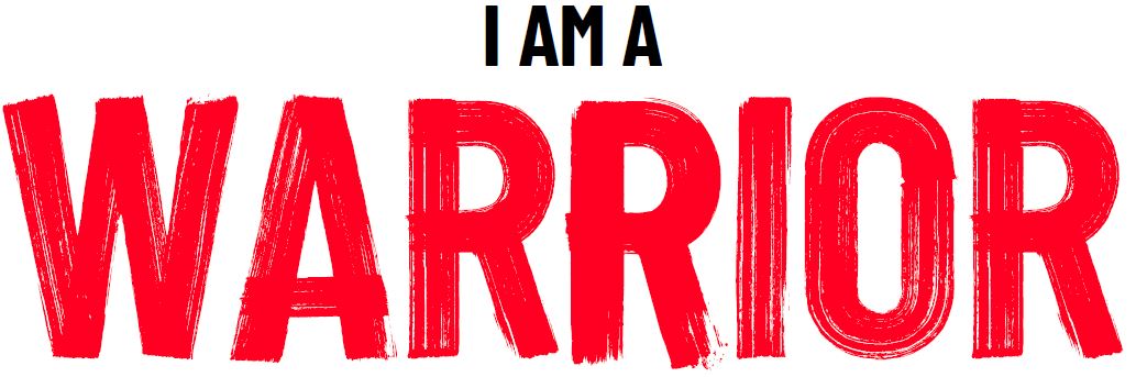
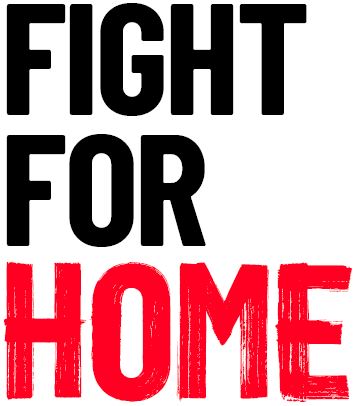
IN YOUR FACE
We use this style for moments when we need to be ‘IN YOUR FACE’ – it might be to confront people, or it might be to show excitement and energy.
When you need to speak loudly, use Barlow Condensed Bold. When you need to emphasise or add extra
meaning, use Shelter Activist.
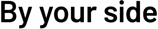
'By your side' style
Barlow Extra Light, Regular or Semibold
Sentence case
Smaller typography
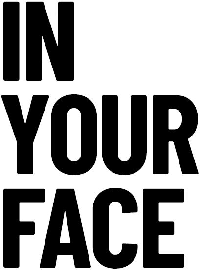
'IN YOUR FACE' style
Barlow Bold Condensed or Shelter Activist
Uppercase
Larger typography
With/without red brush stroke for interventions/emphasis
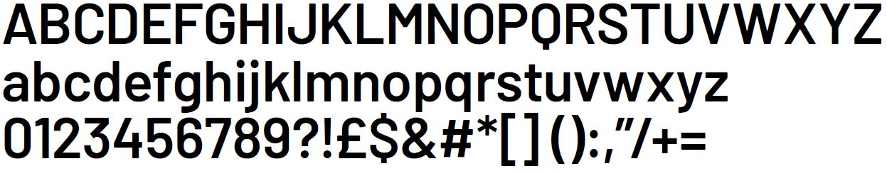
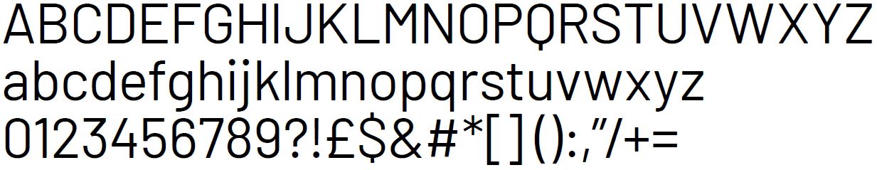
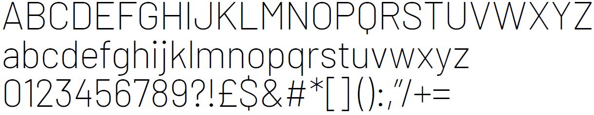
Typeface: Barlow
Barlow is our brand typeface. It has a strong relationship between its condensed (see Barlow Condensed Bold below) and its grotesk cuts. This means you can use it to create ‘By your side’ and ‘IN YOUR FACE’ communications.
We only use Barlow in three weights: Semibold, Regular and Extra Light.
All subheadings, body copy and general information across the brand should be typeset in combinations of these three weights.
You can use italics in print publications to cite references, but never within headings, and never in digital communications.
Barlow is a free, accessible-for-all, open-source Google font. Despite this, we must ONLY use the specified weights from the extensive family.
Leading
Text below 36pt = +2pt (e.g. 9pt text would be 11pt leading)
Text above 36pt = please adjust manually. Ascenders and descenders should never touch.
Spacing
0 letter spacing (tracking)
At larger point sizes, e.g. headlines, you may need to adjust to -10. Set your kerning to ‘optical’
Digital (website) typefaces
For WCAG AA level accessibility, our website ONLY uses:
Barlow Regular
Barlow Bold
When choosing fonts, remember that our website has different requirements. We’ll cover these in the next few sections of this page, but if you have any questions, ask the UX team.
Digital font sizes:
H1 on desktop 50 / leading 65
H1 on mobile 36 / leading 46.8
H2 36 / leading 46.8
H2 on mobile 28 / leading 36.4
H3 25 / leading 35
H4 21 / leading 29.4
body 18 / leading 25.2
small 14 / leading 19.6
system 12 / leading 16.8
We no longer use bold as a default for headers. Bold should only be used when we want to draw attention to content. Uppercase should only be used sparingly on Digital
For further information, visit our Digital UI Kit.
Barlow Semibold (NOT for use on our website - use Barlow Bold as a replacement):
Barlow Regular:
Barlow Extra Light (NOT for use on our website):
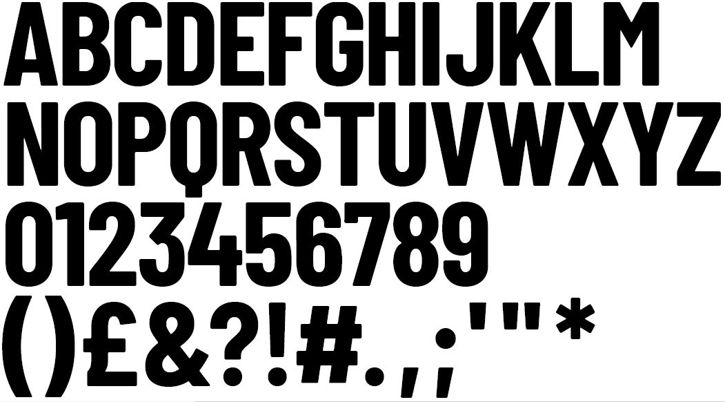
Typeface: Barlow Condensed Bold
Barlow Condensed Bold is used when we want to sound loud, energised and 'IN YOUR FACE'.
Offline, we use it in uppercase – in headlines or to interact with our red brush stroke. Here are a few examples of when we might use this typeface:
Barlow Condensed is a free, accessible-for-all, open-source Google font. Despite this we must ONLY use this specified weight from the extensive family.
Leading
Set the leading by multiplying the font size by 0.83 (e.g. 100pt x 0.83 = 83pt leading).
If it suits the design, the leading can be tighter. Just be mindful of the Q's descender and the punctuation, and ensure the leading is consistent in the communication.
Spacing
10 letter spacing (tracking). At smaller point sizes you may need to adjust to 0. Set your kerning to ‘optical’.
Digital (website) typeface
When choosing fonts, remember that our website has different requirements. Use Barlow Condensed Bold when you need to be ‘IN YOUR FACE’. But only use it for key pages, H1s or labels.
Uppercase Barlow Bold Condensed must not be used for large bodies of text online. In exceptional circumstances you can set this typeface in lowercase for readability, however, this is ONLY ever done on our website.
For sizes and line-heights, see our Digital UI Kit.. If you have any questions, email the UX team.
Barlow Condensed Bold
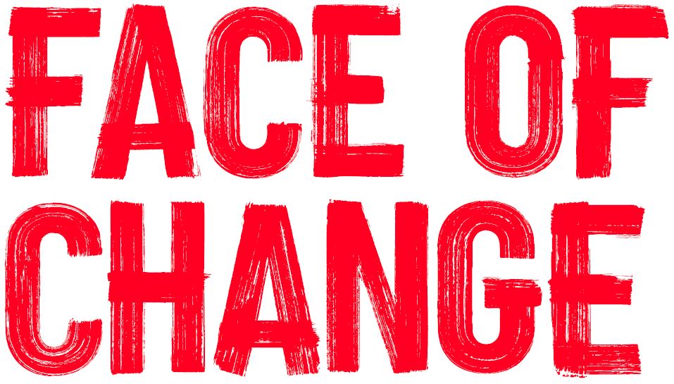
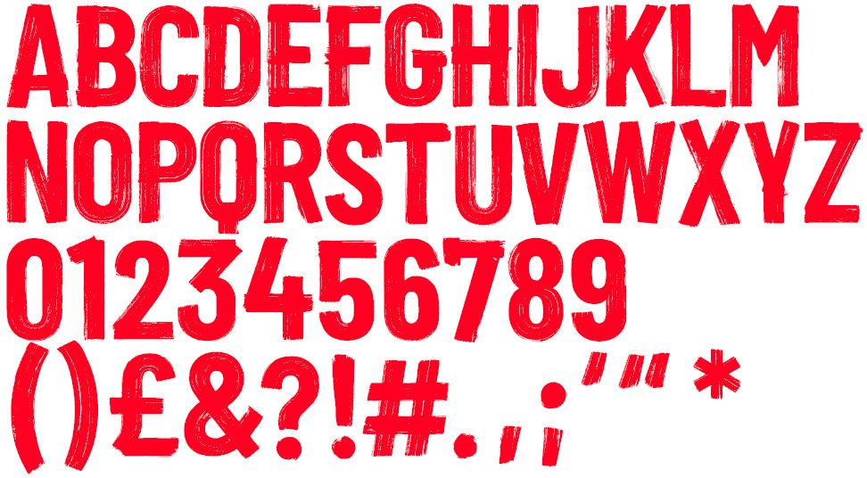
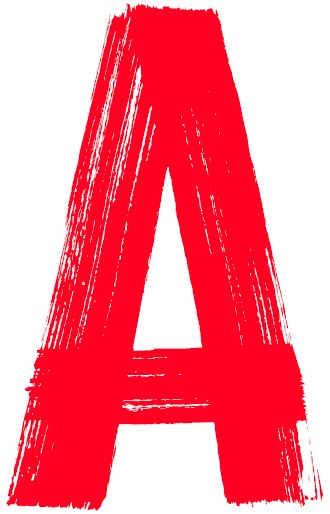
Typeface: Shelter Activist
Shelter Activist is a bespoke typeface and a key asset in our brand.
Created by hand to feel urgent, confrontational, disruptive or positive; it represents human intervention and should only be used for these reasons:
To emphasise emotion or significant points in language, or for use in numbers
There is an additional set of characters to help create a hand-drawn aesthetic - see below.
DO NOT use Shelter Activist for any reason other than stated above or for decoration.
Colour
ONLY use Shelter Activist in Shelter Red (see page 41). In exceptional circumstances it can be black or white, e.g. monotone prints.
Leading
Shelter Activist can be used more freely than our other typefaces, to create a hand-painted aesthetic.
As a general rule, set the leading by multiplying the font size by 0.78 (e.g. 100pt x 0.78 = 78pt leading).
If it suits the design and helps you to create the hand-drawn feel, the leading can be tighter. Just be
mindful of the Q's descender and the punctuation.
Spacing
Set the tracking to between 0 and -10. Choose the value which best suits your design. Set your kerning to ‘optical’.
Additional crafting
To enhance the hand-drawn feel, we can:
move letterforms off the baseline
rotate the letterforms
make the kerning less ‘perfect’
Digital (website) typeface
When choosing fonts, remember that our website has different requirements. If you'd like to use the Shelter Activist font online, please ask our UX team.
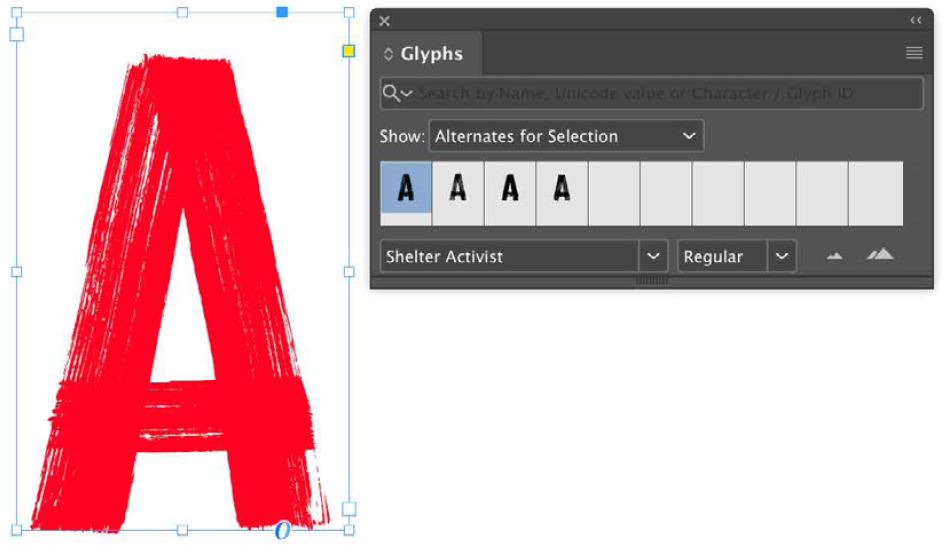
Shelter Activist
Shelter Activist comes with a suite of extra characters built in.
This helps to avoid repetition of the core alphabet within a single word, e.g. ACTIVIST, which helps enhance the hand-drawn feel.
The extra characters have different levels of ‘show-through’ in the brush strokes. This allows you to choose the most readable letterforms to sit over imagery and typography.
Using additional characters
You can find additional characters in the Glyphs panel on Adobe CC software. Or you can select the letterform with the cursor – you’ll see a quick swap option appear at the bottom right of the screen.
Core alphabet
Alternative characters

Glyphs panel within Adobe CC software
Setting type
Grids
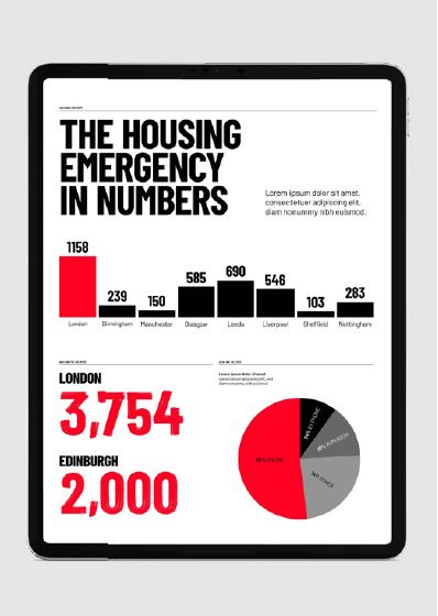
For a more flexible system in print collateral, we suggest using an eight-column grid. Use the first two columns to contain pull quotes, statistics and other key information. Then display body copy across two main columns in the remaining space.
Headlines
For ‘By your side’ articles, set headlines in sentence case Barlow Semibold.
For ‘IN YOUR FACE’ articles, set headlines in uppercase Barlow Condensed Bold (with or without brush interventions).
If the subject matter is more neutral, or for legal documents, set headlines in Barlow Semibold.
Subheadings
Typeset these in the best weight to contrast with the headlines. Typically, this’ll be Barlow Semibold.
Body copy
All body copy and general information should be typeset in Barlow Regular.
For readability, body copy should be arranged on the left. That said, you can centre small amounts of copy.
Standfirsts and pull quotes
Use Barlow Extra Light, Regular, Semibold or Condensed Bold. Shelter Activist also plays a role in pull quotes – for example, if you’re looking to emphasise a certain statistic.
Think of your audience and select a font that feels right for them.
Call to action
Use Barlow Semibold or Condensed Bold. Think about making these smaller than the headline text.
Setting type examples
Font key:

‘By your side’
'IN YOUR FACE'
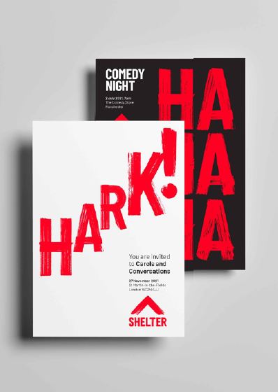
Typographic interventions: with characters
Using Shelter Activist to make typographic interventions is an important part of our visual identity.
It allows you to turn negatives into positives and add meaning to words, or emphasise them.
Be creative, but stick to these rules:
keep it relevant to our work
don’t be basic or generic
only use one modification per word
See below for our dos and don’ts.
Think of your intervention as a human hand, urgently modifying or correcting a problem. It’s important you capture this. You can do it by:
choosing the best letterforms from our additional characters for readability
using characters that are up to 15% larger than words in Barlow Condensed Bold
positioning so the original word underneath is still readable
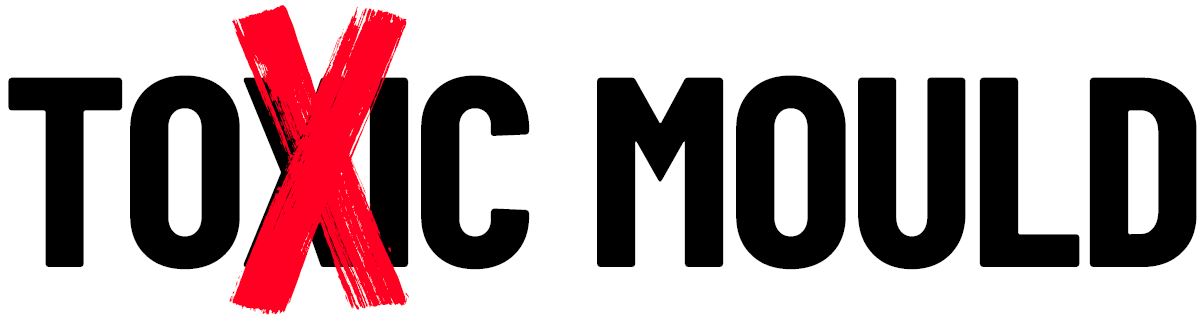
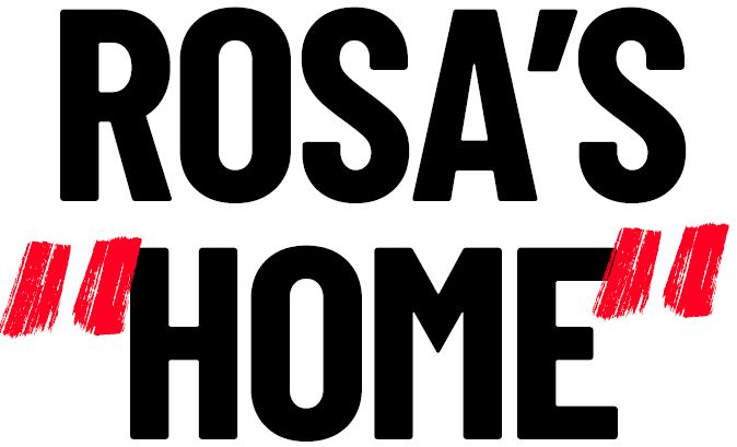
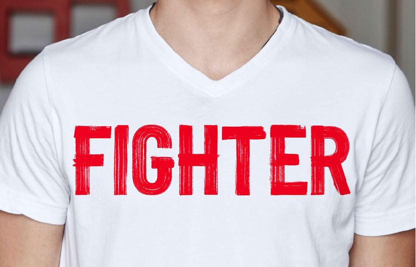
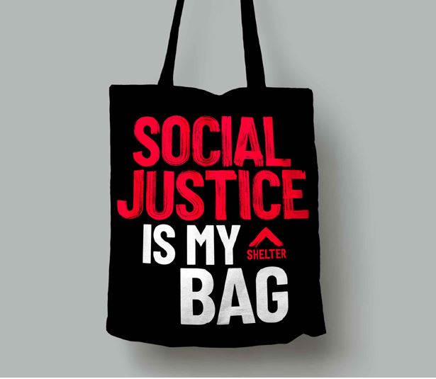
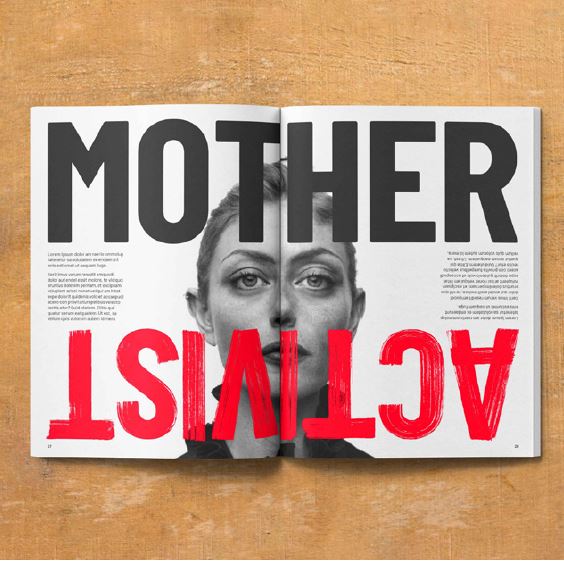
Adding meaning: using Shelter Activist to change a word and add new meaning:

Adding meaning: showing how we feel about bad housing conditions:
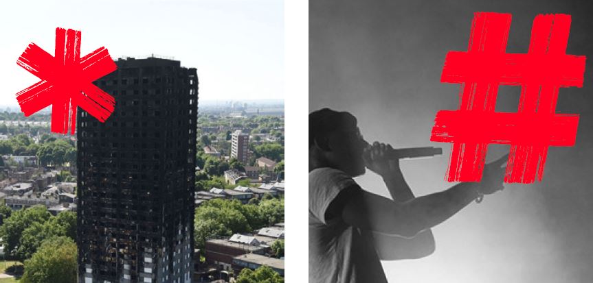
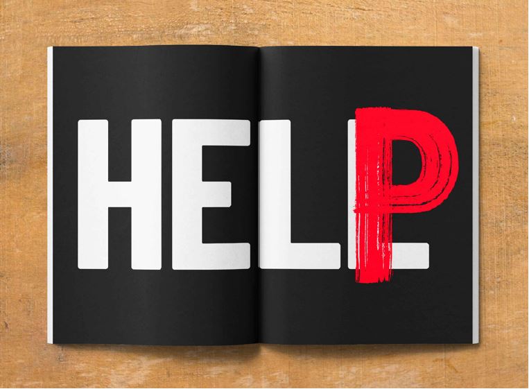
Typographic interventions: with punctuation
You can create impactful typographic interventions by using Shelter Activist’s punctuation.
Follow the same principles as 'typographic interventions: with characters' above:
turn negatives into positives
add meaning to words or emphasise them
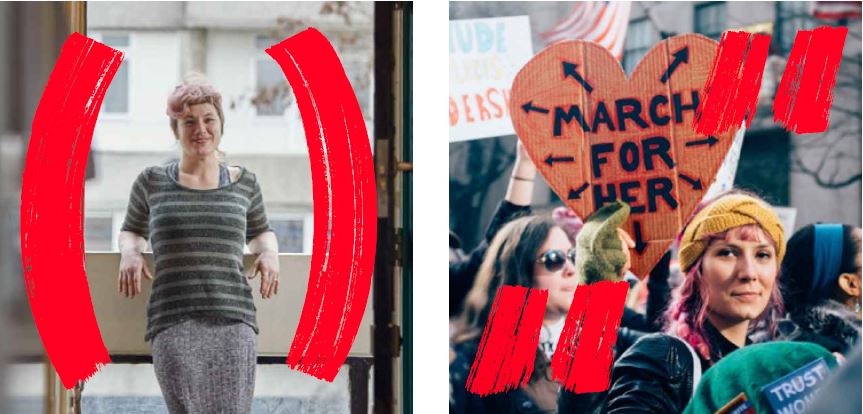
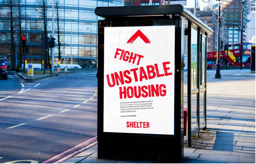
Imagery interventions
Use punctuation to change or add meaning to our photography. Use them to tell stories, show support, highlight causes, have an opinion or ask questions.
You can be large and loud, or small and quiet. But make sure the technique is used to communicate in a ‘By your side’ or ‘IN YOUR FACE’ way.
Punctuation examples
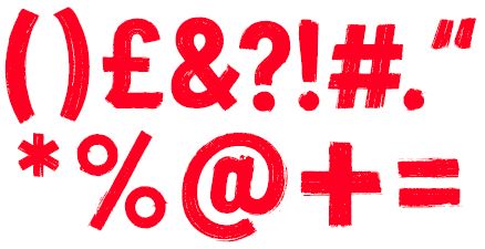
Adding meaning: using Shelter Activist punctuation
Adding meaning: using Shelter Activist punctuation to add meaning to imagery
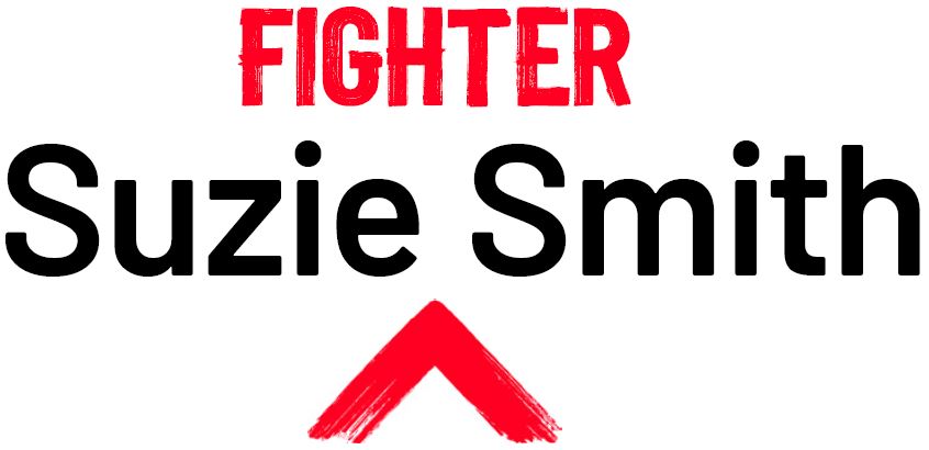
Typographic interventions: with words
You can also make typographic interventions by inserting more than just characters or punctuation. You can use entire words to add new meaning or add emphasis/power to a specific statement.
We call these 'statement words', and they allow brush typography to dominate the space.
When using this technique, you can use a maximum of four words in Shelter Activist.
Typographic intervention: examples of adding new meaning or emphasis/power to specific words with Shelter Activist
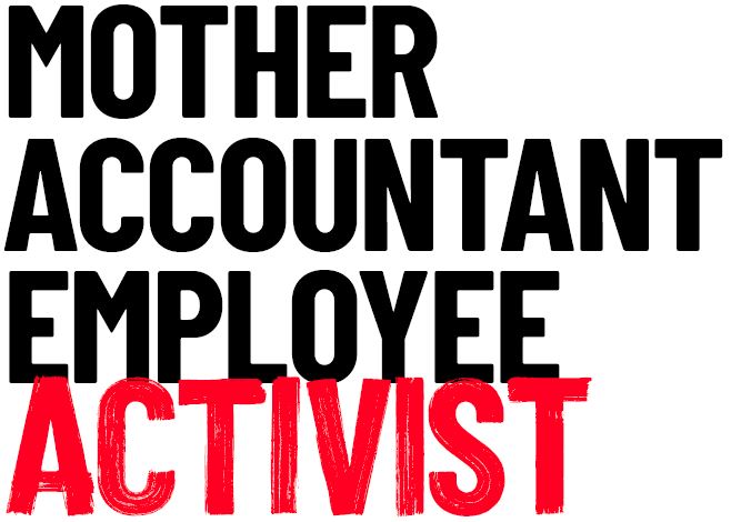
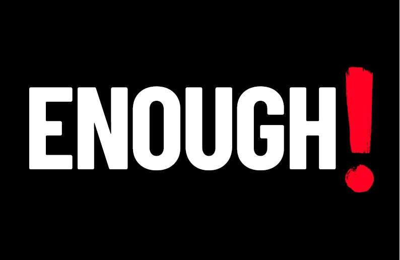
Shelter Activist: Statements and numbers
You don't always have to pair Shelter Activist with Barlow Condensed Bold or an image.
If you’re speaking in emotive, cause-led language, or you’re emphasising numbers and stats, you can use Shelter Activist on its own.
You can even use it for onomatopoeic words, for when we really want our voice to be heard.
When using this technique, never insert more than four words. For numbers and stats, you have more
freedom – but avoid using Shelter Activist at small point sizes.
Shelter Activist examples:
Cause-led language
Onomatopoeic words
Numerals and stats
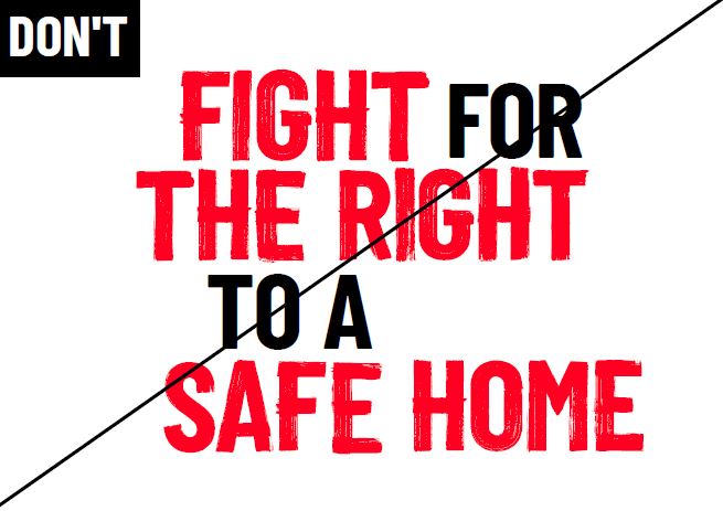
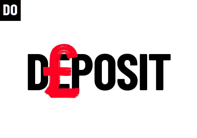
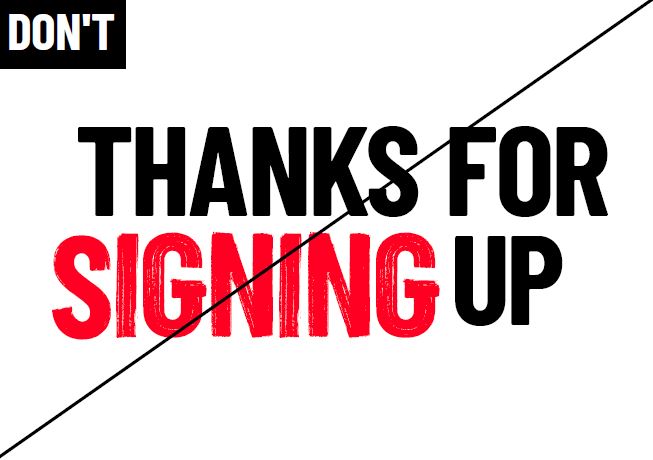
Dos and dont’s
Make it relevant
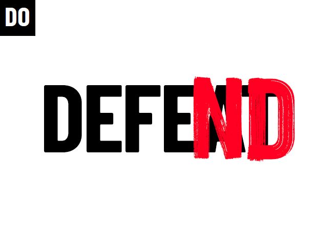
Your typographic interventions must relate to our work, e.g. change 'defeat' to 'defend'.
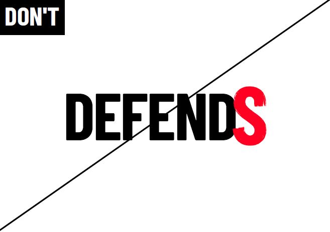
Avoid basic interventions
Shelter Activist is used with purpose. Simply changing a word to a plural isn't purposeful enough. Words like this are technically on-brand, but should be done with caution as they are less ownable and may appear generic.
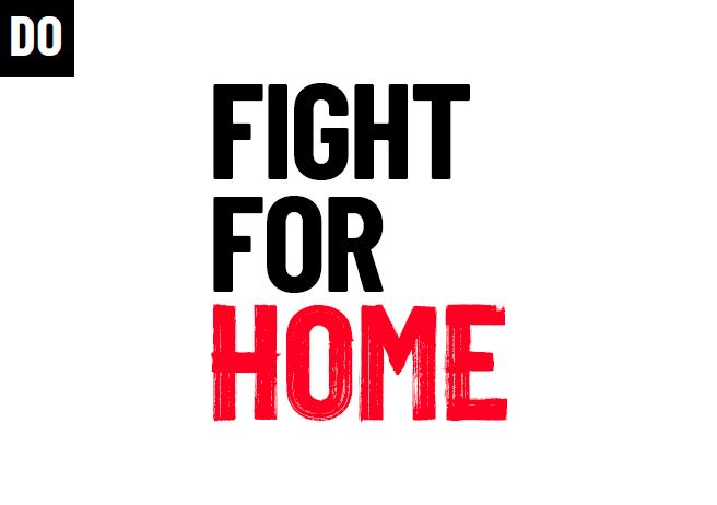
Make a statement
Insert entire words to add meaning or emphasis in a sentence.
Avoid over-using Shelter Activist
Don't use more than four statement words in a sentence.
Be purposeful
Typographic interventions should try to add or emphasise the meaning of words, not simply be used for decoration.
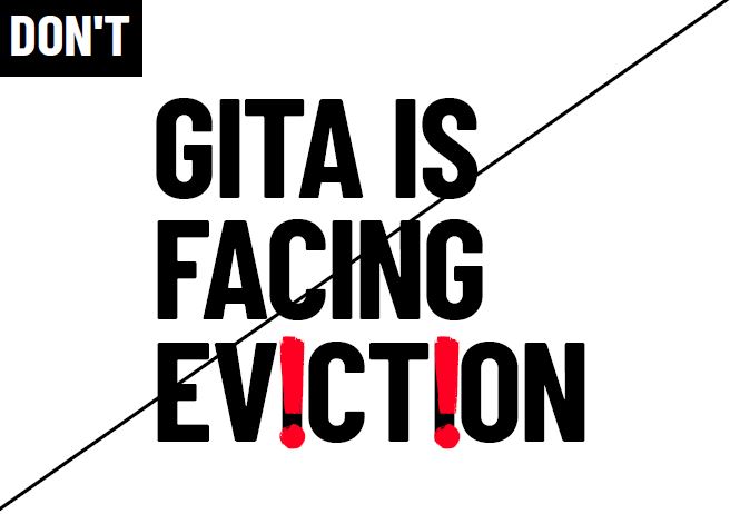
Avoid sensationalising words and statements
Always be sensitive to your subject.
Emotive, cause-led language
Try using Shelter Activist as a stand-alone typeface,
when using emotive language.
Avoid using Shelter Activist decoratively
Shelter Activist should not be used to simply pull out a word. Consider your message and think conceptually.
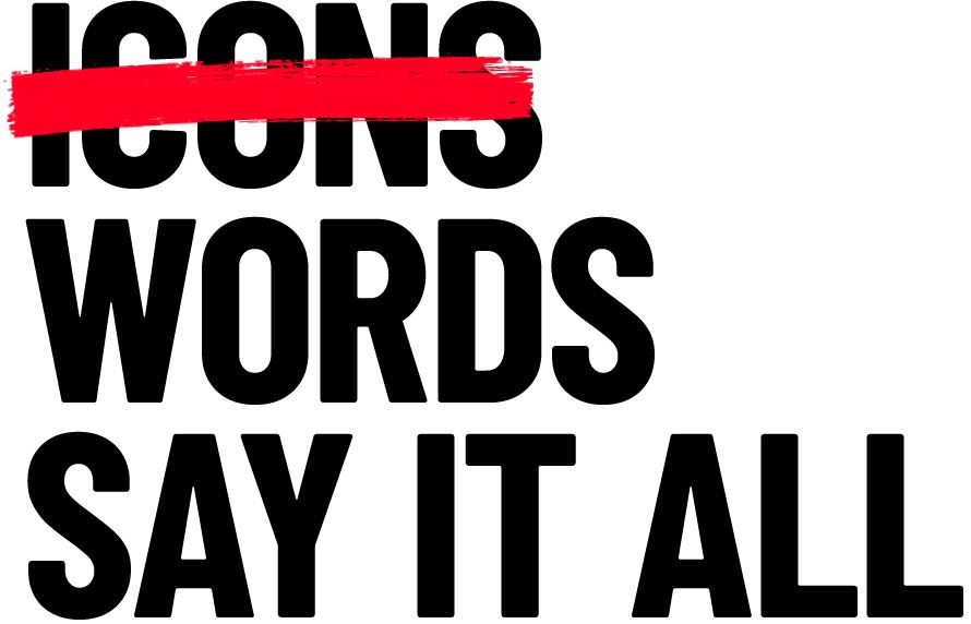
Words replace icons
We don't use icons in our creative.
Our brand allows us to communicate in different and exciting ways that don’t rely on iconography.
The only place where we use icons is on our website to help with user navigation.
Typography in action
Questions about our typography?
Contact the Shelter marketing team