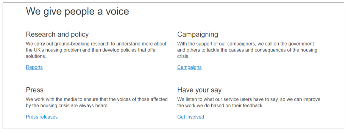
Content grid-4 component

The content grid-4 is a 2-by-2 layout of text blocks – a great way to promote and link users to other content using short text.
You can use it in either an advice page or content page template, below the rich text editor (RTE).
Options:
you can give the grid an H2 header but it’s not required
each block lets you format text as normal text or H3
include hyperlinks
include a border beneath each row of text blocks
you can leave any block empty e.g. just use the first three blocks
If you have more than four blocks of text, you can stack two or more components.
Limitations: You can't embed images or any other content within the grid.
Create a Content grid-4 component
Use Add entry and select Component – Content grid-4
Name – this is the system name seen in Contentful
Header – this will display as an H2 header above the grid (optional)
Add your text to each grid box and format it
Border – select ‘Yes’ to include a thin border between content blocks
Background colour – select a white or grey background
Bulleted – select ‘Yes’ to add a square bullet point to each content item
When you’re ready, Publish the component.
Any questions? Email Lindsay Foley in the Central Digital team.
