Content page template
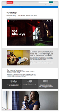

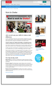
The content page is Contentful’s most versatile template. You can give it a range of content types and layouts.
The template gives you two overall layout options using the Content width dropdown:
100% – for content blocks designed to use the full screen width on desktop, such as the Two column text and image block component or the Stats component.
Two thirds with sidebar – which constrains any content in the main column to the width of the text, but allows you to make use of the right sidebar with a range of content types. On mobile, sidebar content displays below the main column content.
Both widths let you add a hero top of page if you want, and both are fully responsive on mobile screens.
Examples:
https://shelter-website.netlify.com/WR-Support%20us%20Landing%20page/wr-run/several-components-for-reference-two-thirds
https://shelter-website.netlify.com/WR-Support%20us%20Landing%20page/wr-run/several-components-for-reference
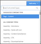
To start, either find an existing content page using the Content type search or create a new page using Add entry.
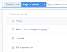
Then complete your fields:
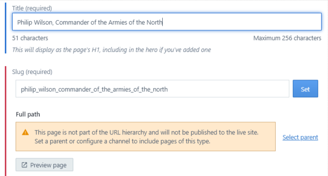
Title – if you don’t give the page a hero this will generate the H1 atop the page. If you do use a hero, that will provide your page’s H1.
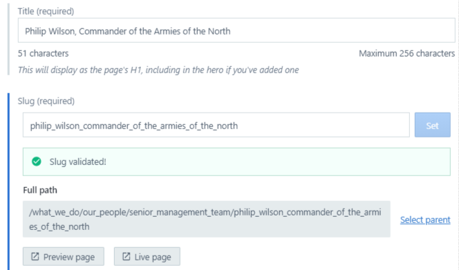
Slug – this will be auto-generated when you complete the Title field. Once your slug is in place, click Set to validate it.
NOTE: Once your slug is set and your page published, do not change it. A page’s URL is the address the entire web knows it by. To change it invites mayhem.Full path – click Select parent to assign a tree hierarchy to your page, which assigns a full path (everything below the root domain) to give your path a URL. (Note: until you select a parent, you will only see the Preview page option. Once your page has a full path, the Live page option appears.
In the pop-up window, open the navigation tree you’ll use (Main, Housing advice or Legal). Open each level and sub-level until you find the page which will be the parent to yours. Click the link icon. Back on your page, a full path should now appear and the Live page option will appear. The live page view will not work until you’ve published the page.

Content width – with this template, you need to choose between:
100% (full width) setting, which on desktop will display text at our normal 2/3 width column but all other content at full screen width with no right sidebar content
Two-thirds setting, which constrains everything to the 2/3 column but lets you use a full-width hero and also the sidebar. On mobile, sidebar content will display below the main column content.
100% example: https://website-assets-6434318868.gtsb.io/tests_and_demos_for_tree/field-guide-to-the-content-page-template-full-width
Two-thirds example: https://website-assets-6434318868.gtsb.io/tests_and_demos_for_tree/field-guide-to-the-content-page-template-two-thirds-width
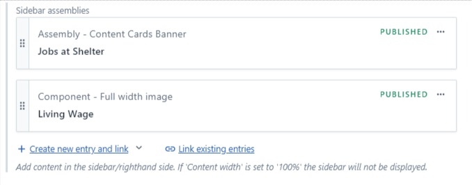
6. Sidebar assemblies - to populate the right-hand sides. You can add 6 content types:
Full width image component
7. Hero content – Create a new hero or link to an existing entry. Choose from:
Standard hero with card
Hero - no card
Donation hero with slider
Donation hero with input box
8. Body copy – this is the rich text editor (RTE) where you can add and format your page’s main text, and embed images or other content within it. (See Creating your contentfor guidance on text formatting.)
Embed content in the RTE – click the Embed option upper right in your RTE and use Entry to add up to 8 types of content:
Or click Asset to add images from the Media library.
9. Assemblies – if you want to add content below your body copy – a ‘Share this page’ block, a download banner, etc – you can link to it here.
10. Page meta information – all web pages need metadata, so you can create this here. (For help, see our guide to this component.)
11. Review notes - for now, ignore this and any fields below it. These will be revisited when the system’s workflow is designed and built.
When you’re ready, Publish your page.
Any questions? Email Lindsay Foley in the Central Digital team.
