Colour

Primary palette
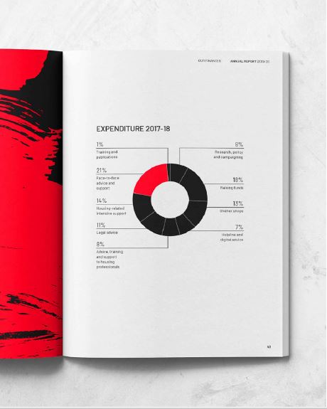
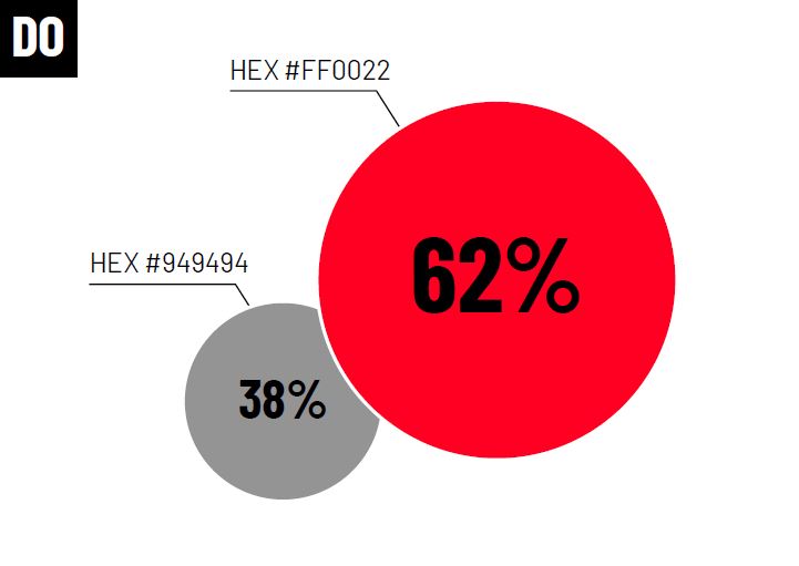
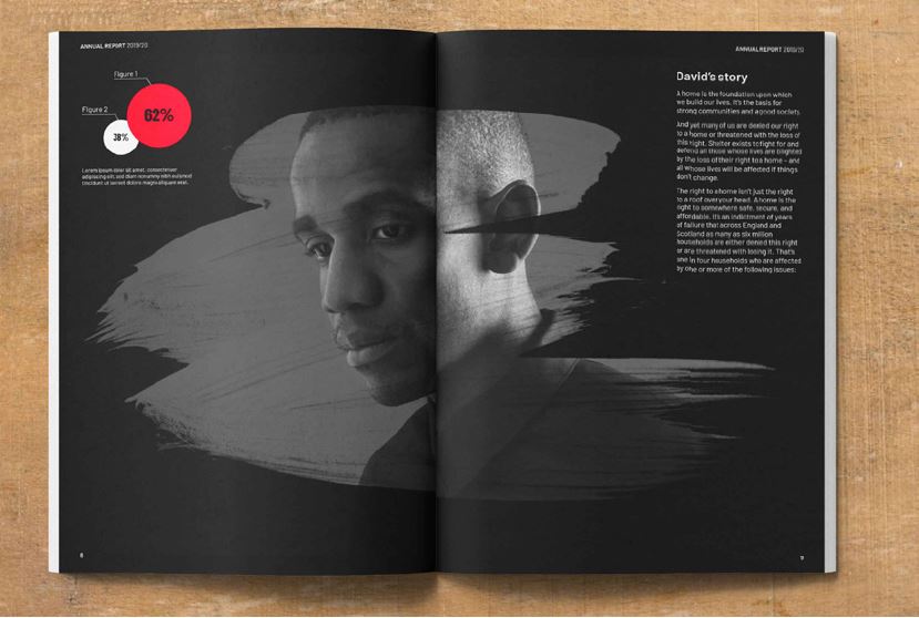
We're a primarily black and white brand that uses red in our paint brush assets – for impact and to add meaning – as well as in infographics.
Never use red as a solid background or for decoration. You must always use it to communicate a message.
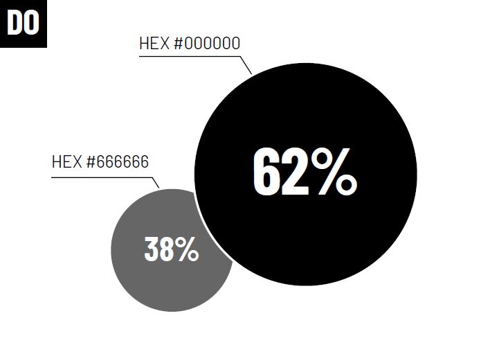
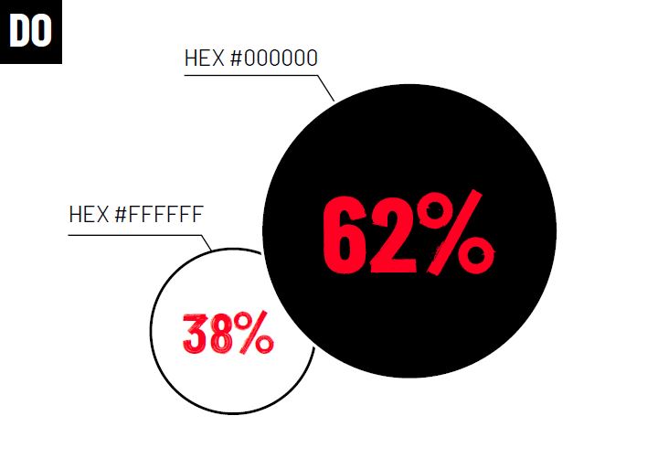
We use black and white backgrounds to create space for our elements. These colours allow our red brush to really pop.
Name | Colour codes | |
 | Black | PMS Black 6 |
|---|---|---|
 | White | C0 M0 Y0 K0 |
 | Shelter Red | PMS 1788 |
 | Rich Black Can be used to give graphics more depth in colour, e.g. large text set in Barlow Bold Condensed. | C50 M50 Y50 K100 Please note, if you’re using Rich Black as a background where small text is in the foreground, you might need to add a 0.5pt Black stroke to the text. Do not use Rich Black for small text. |
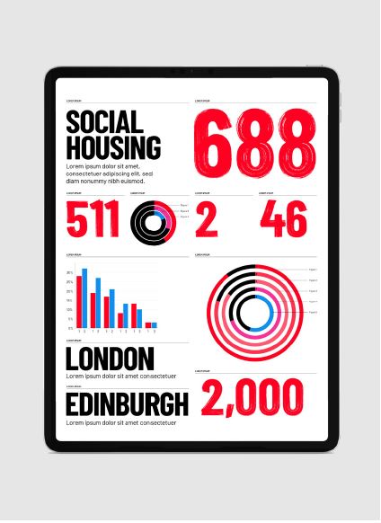
Infographic palette
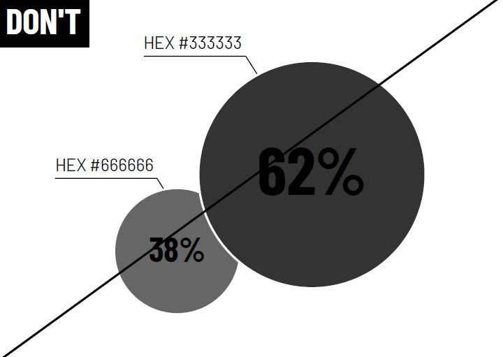
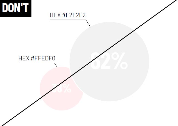
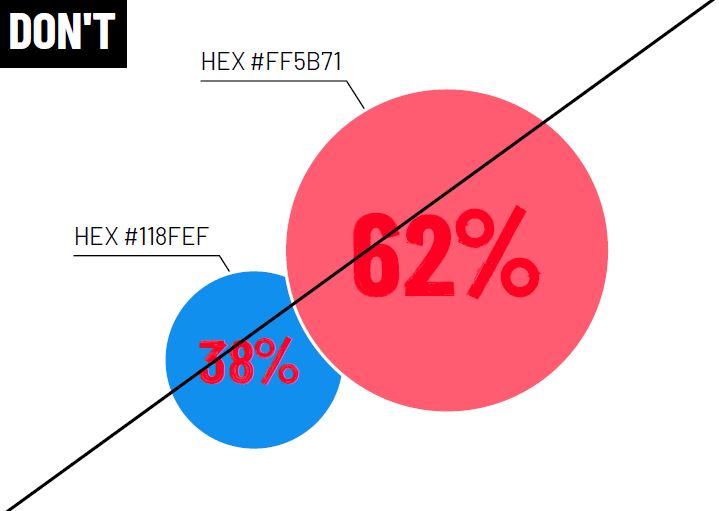
We only use this palette for infographics: graphs, tables, charts. Before using these colours, consider using our primary palette first, above.
When creating infographics, we recommend the following approach to using colour:
Focus on using the primary colour palette first
If you need more colours than Black, White and Shelter Red, try introducing the Black and Red tints from our infographic palette
Use the Pink and Blue swatches for complicated infographics, or when you want to add a flash of colour
Primary palette
Our primary palette should be enough for most infographics. Make sure you try using it first.
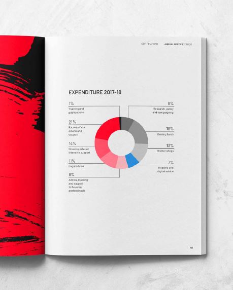
Infographic palette
Use Black and Red tints, along with Blue and Pink swatches to support the primary palette.
The infographic colours - There are no set rules here, but try to keep things simple.
Name | Colour codes | |
|---|---|---|
 | Black Tint 5 | PMS Black 6 (80%) |
 | Black Tint 4 | PMS Black 6 (60%) |
 | Black Tint 3 | PMS Black 6 (40%) |
 | Black Tint 2 | PMS Black 6 (20%) |
 | Black Tint 1 | PMS Black 6 (7%) |
 | Blue | PMS 299 |
 | Pink | PMS 211 |
 | Red Tint 5 | PMS 1788 (80%) |
 | Red Tint 4 | PMS 1788 (60%) |
 | Red Tint 3 | PMS 1788 (40%) |
 | Red Tint 2 | PMS 1788 (20%) |
 | Red Tint 1 | PMS 1788 (7%) |
Digital palette
These extra colours comply with Web Content Accessibility Guidelines (WCAG) AA accessibility standards. Use them for our digital communications – on Shelter websites or for social media.
Our websites uses more colours than you’ll see on this page. This is to improve usability. For more digital-only colours, take a look at our Digital UI Kit.
Name + application | Hex | |
|---|---|---|
 | Accessible red (used for primary link and buttons) | #EB001F |
 | Dark backgrounds: 85% tint black | #262626 |
 | Standard text: 80% tint black | #333333 |
 | Text links: Blue | #336DF5 |
 | Dark borders: 60% tint black (used when the contrast needs to be high e.g. on the border around a search box) | #666 |
 | Light borders: 20% tint black | #CCCCCC |
 | Light backgrounds: 5% tint black | #f2f2f2 |
 | Hover state (for primary buttons only, otherwise use accessible red) | #C8001A |
Online accessibility
This is about making sure there are no barriers that stop people with disabilities from accessing
digital spaces.
Around 14.1 million people with disabilities live in the UK today. A range of auditory, cognitive, neurological, physical, speech and visual impairments might stop them from accessing information online.
When sites are designed, developed and edited in an inclusive way, most users have equal access to information and functionality.
All of Shelter’s digital communications must meet WCAG AA level accessibility. Below is guidance for accessible infographics, and here are Shelter’s full accessibility guides and best practice – for writing, producing social media content and more.
Infographics in print
An infographic in print doesn't have the same accessibility needs as one online.
Infographics online
When the same infographic moves online, you might need to change colours and text size
to meet with WCAG AA level accessibility.
Accessible infographics online
These are the important things you need to think about to meet WCAG AA level accessibility:
If you can clearly say it using text alone, then you should
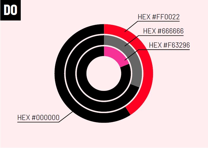
Some people are colour-blind, so don’t use colour alone to show meaning. Always use connecting lines between the graphic and the label
Make sure your font sizes are big enough. On Shelter websites we generally use 18pt+
Make sure screen-readers aren't excluded. Write a short description of the infographic in the alt text and a detailed description in the body text
Try to publish images as a scalable vector graphic (SVG), instead of a JPEG
Using colour behind text
To meet WCAG AA level accessibility, make sure the foreground and background colours have a good contrast ratio.
The minimum contrast ratio must be 4:5:1. If in doubt, use the WebAIM contrast checker.
Try to avoid uploading images of text online – the text should be rendered in HTML (i.e. included in the body text of the page). If you have to use images of text, add alt text.
The only exception to this rule is social media. If you're unsure, please ask our UX team.
Black text
White text
Shelter Red text
You must use Shelter Activist online at 18pt or above.
Avoiding inadequate contrast ratios
Don’t use black text on backgrounds that
don’t have a good contrast ratio.
Don’t use white text on backgrounds that
don’t have a good contrast ratio.
Don’t use red text on backgrounds that don’t have a good contrast ratio. For example, the Red tints or Blue.
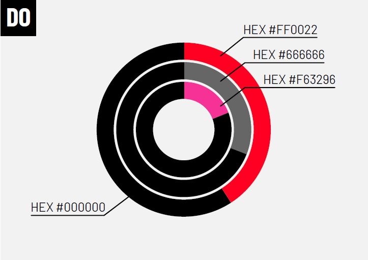
Using colour for infographics
To meet WCAG AA level accessibility, the foreground and background colour must have a good contrast ratio. The minimum contrast ratio must be 3:1. If in doubt, use the WebAIM contrast checker.
We mainly use black and white background colours, but sometimes, we might use a brush graphic background in Shelter Red.
You can also use Black Tint 1 and Red Tint 1 from our infographic palette as a background colour, but only within an infographic and not as background colours for full pages.
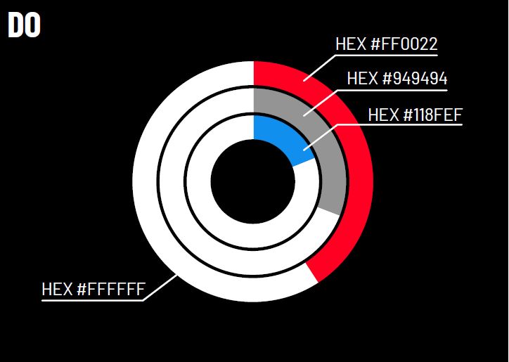
Black background
All colours in our palette are accessible on a black background, except Black Tint 5, so avoid using it in this context.
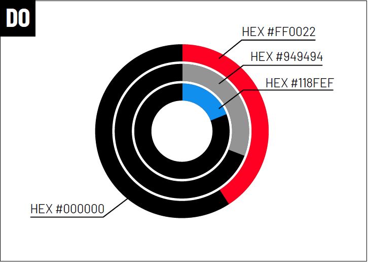
White background
Most colours in our palette are accessible on a white background, but make sure you avoid the lighter tints.
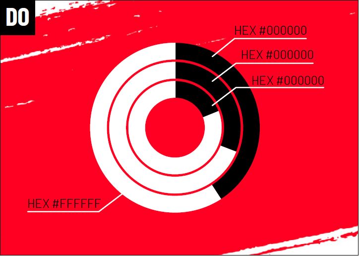
Shelter Red background
Only a limited number of colours in our palette are accessible on a Shelter Red background. Stick to Black, White and only the lightest tints.
Black Tint 1 background
When using a Black Tint 1 background, avoid using the lighter tints in the foreground.
Red Tint 1 background
When using a Red Tint 1 background, avoid using the lighter tints in the foreground.
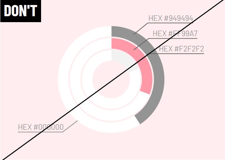
Avoid inadequate contrast ratios
Don’t combine colours that don’t have a good contrast ratio.
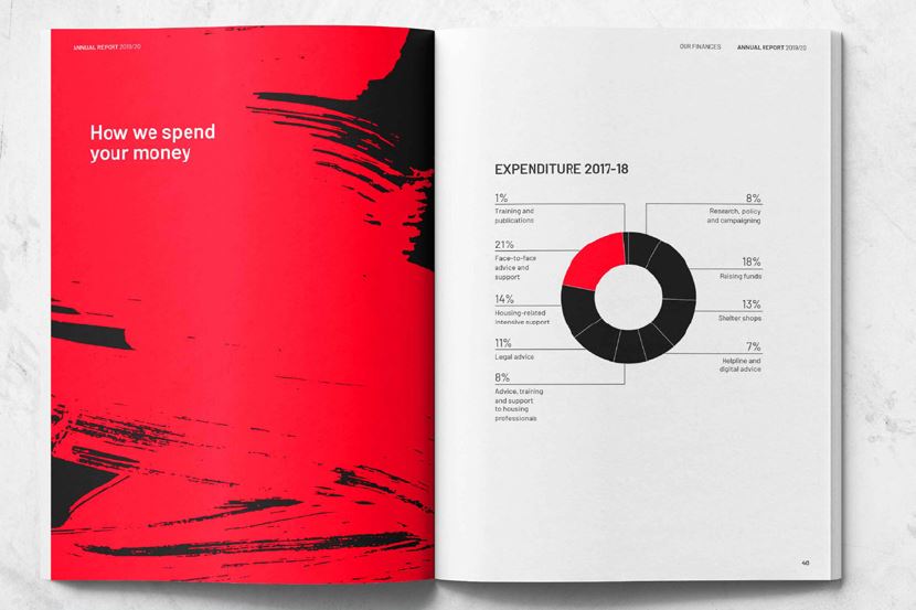
Colour in action
Questions about our colours?
Contact the Shelter brand team