Video supers
Shelter’s guide to use of supers in our videos, for titles, text or graphics.
Supers is the collective term for titles, text, or graphics added to video. They should be used purposefully and to add meaning. This guide describes writing and designing supers in line with Shelter's house style.
(Supers do not include subtitles, which are text displayed to assist deaf or hard of hearing viewers. Read our guide on subtitles.)
Supers can be used to provide additional information such as an interviewee’s name, deliver your call-to-action, or to emphasise key parts of your message.
Three rules of thumb for writing supers
Please ensure all copy is written to meet our brand guidelines.
1. Text and audio
Onscreen copy should not appear when there is spoken dialogue. Viewers are generally unable to read and listen at the same time.
2. Reading speed
Keep your onscreen text simple and short. The average reading speed reduces from 200-240 words per minute for static text, such as a book, to 120 words per minute when reading within a video. Take this into account when writing your copy for video, use simple plain language, and refine the text to the minimum word count to communicate with optimum meaning and clarity.
3. Call-to-action
Your call-to-action (CTA) should be clear and strong. Don’t be afraid to be plain about what you want the viewer to do after watching your video, and what the result of their action will be. Consider where else your CTA appears in accompanying social copy and the video’s descriptor text.

This video call-to-action is clear and inspiring. Typeface Shelter Activist. Centre aligned.
How to design supers
The Creative team cannot always respond to requests, so it’s useful to know what good looks like.
All titles, text and graphics should be designed in line with our house brand, and to communicate clearly and directly with the viewer.
Two styles to consider
Shelter has created a human approach to how we speak and use typography, using two styles that strike different tones:
By your side - To show people we care and we’re ‘By your side’. To strike this gentler tone, set your text in sentence case and use a smaller font size
IN YOUR FACE - To confront the viewer or show excitement and energy. When you need to speak loudly, use Barlow Condensed Bold. When you need to emphasise or add extra meaning, use Shelter Activist
Typography fonts
Shelter’s house font Barlow is free to download from Google Fonts. We use Barlow in three weights:
Semibold - recommended for video
Regular - used for bi-lines (see the example below showing a Lower Third)
Extra Light - the lightest weight, not generally recommended for video supers
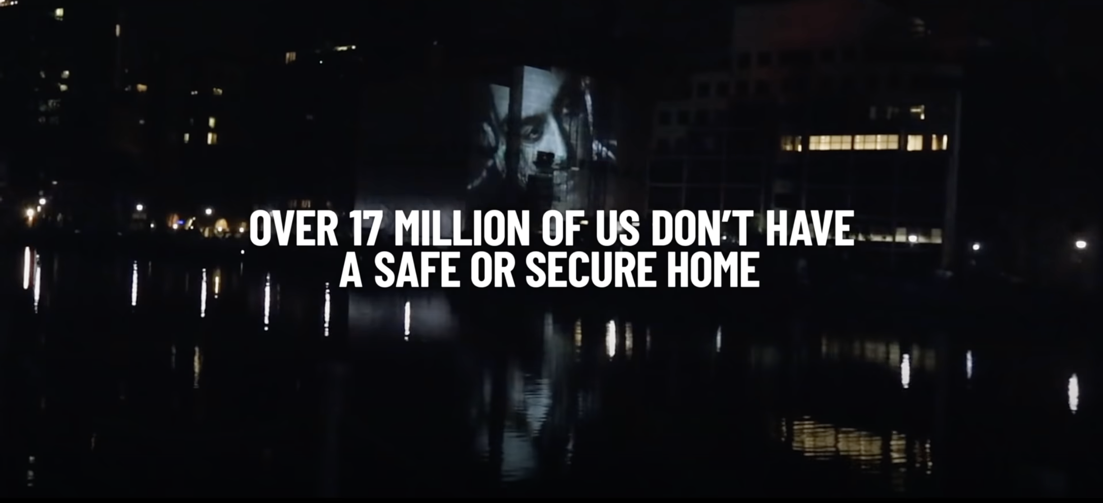
Barlow Condensed Bold is used in upper case when we want to sound loud, energised and ‘IN YOUR FACE’.
Typography colour
We're a primarily black and white brand. Onscreen copy can appear as white type on a black background, black type on a white background, or white type on video footage.
We only use red in our paint brush assets and to add impact and meaning. Never use red as a solid background or for decoration. You must always use it to communicate a message and as a purposeful part of your storytelling.
For more on use of the colour red, through our paint brush assets, typography interventions or Shelter Activist font, refer to Shelter’s brand guidelines.
Primary Colour Palette

Black
PMS Black 6 C0 M0 Y0 K100 R0 G0 B0
Hex #000000

White
C0 M0 Y0 K0 R255 G255 B255 Hex #FFFFFF

Shelter Red
PMS 1788
C0 M100 Y95 K0 R255 G0 B34 Hex #FF0022
Giving your supers high readability
When adding text directly to video, your choice of background footage is key to making your super easily readable. The footage should not work against the viewer’s attempt to read the text.
Choose footage that:
doesn't contain distracting movement
has tone and saturation that doesn’t reduce text readability
has composition which doesn’t fight with your text
contains elements to support your story, without being distracting
Ensure text stands out clearly in the foreground, with appropriate typography and layout. You can use the Squint Test to assess what is known as a designs visual hierarchy and that text is communicating clearly and effectively.
Best practice examples
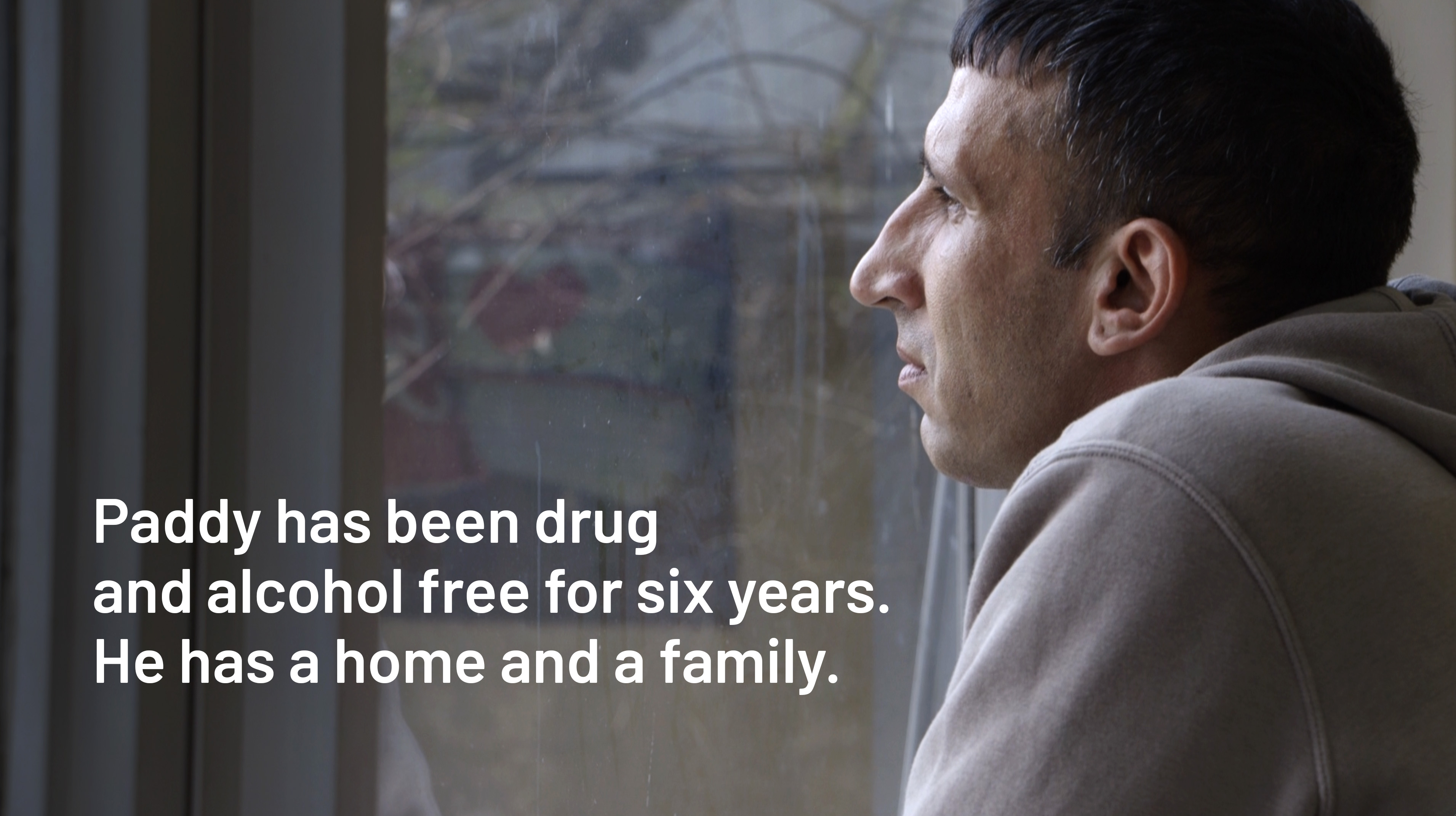
Typeface Barlow Semibold. Text size 82pt. Left aligned.
In this example with Paddy, the copy is limited to two short sentences and the high contrast ratio between the background video and text makes it easy to read.
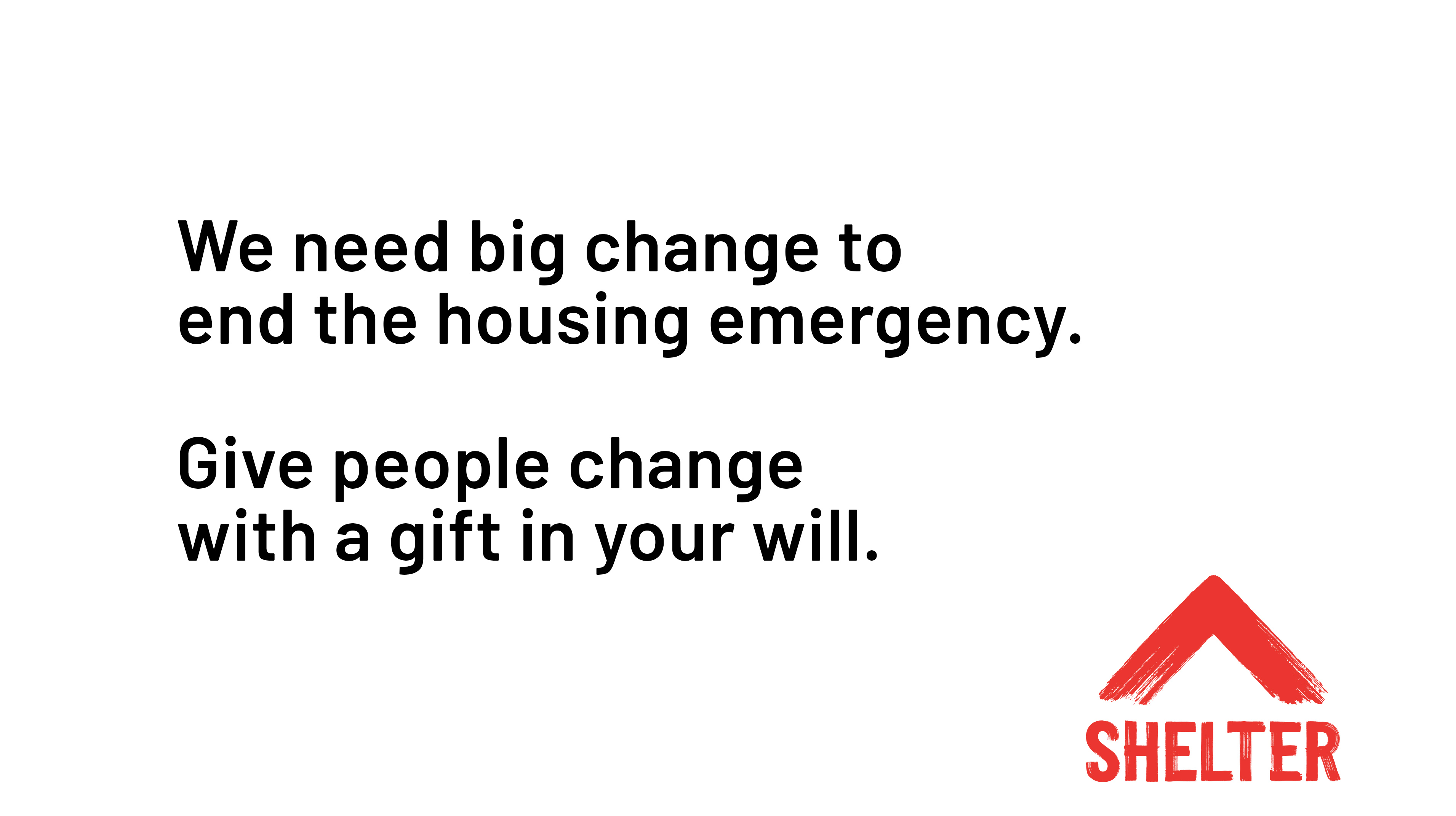
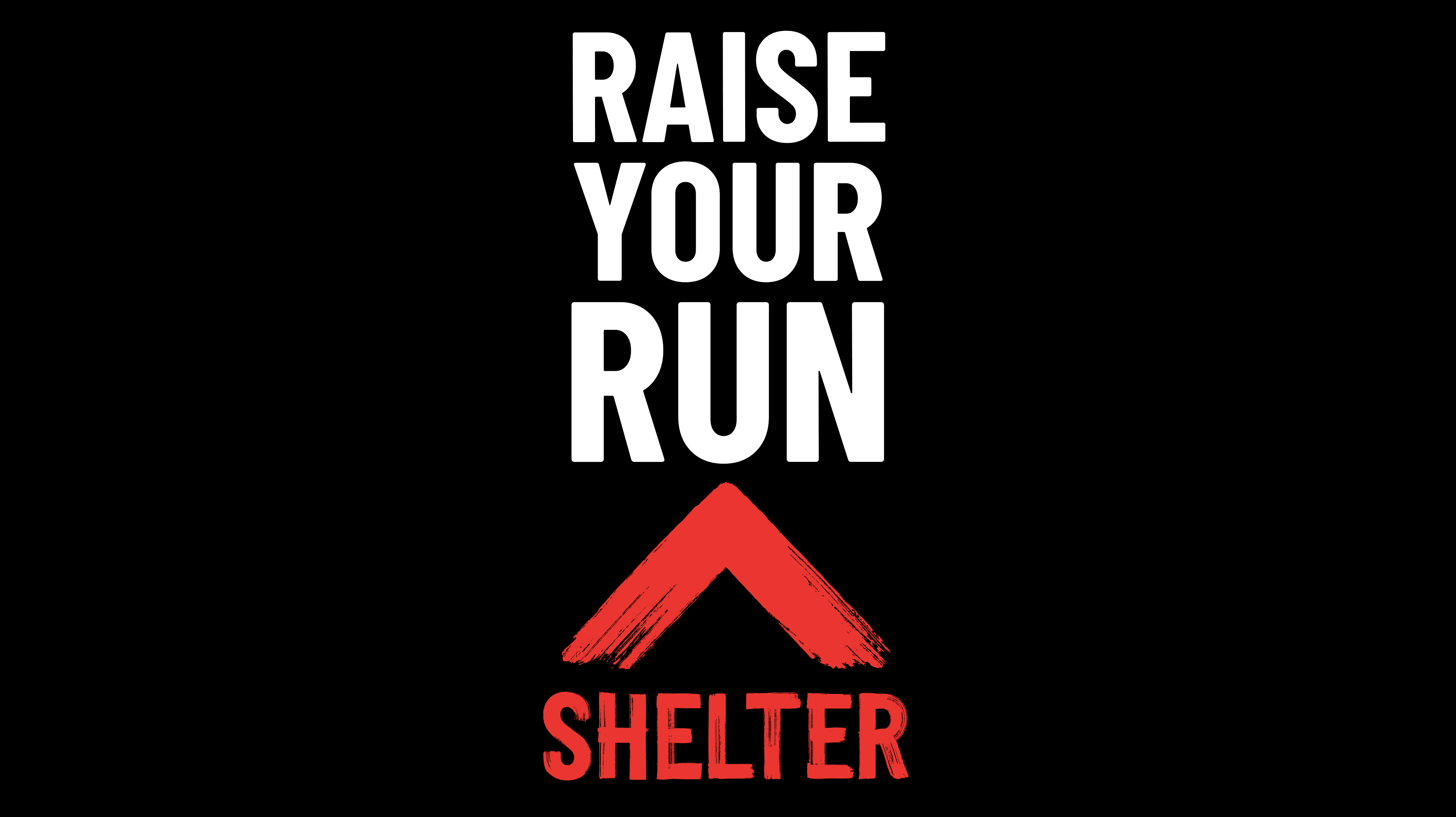
Choose the appropriate typography style, formatting and alignment for your video supers and keep them consistent throughout. Here, the example on the left uses By your side - more restrained to suit the fundraising appeal. The super on the right uses IN YOUR FACE - loud and energised, challenging the viewer to participate in a sporting event.

Main title is Barlow Semibold, the bi-line is Barlow Regular. Type size 75pt. Left aligned.
Using lower thirds
A lower third is a combination of text and graphic elements placed in the lower area of the video frame, to provide additional information - most commonly the name and title of a person on-camera.
It's generally best to keep copy as brief as possible, so it’s easy to read and doesn’t detract from what the person is saying.
All elements of the lower third should work together to add to the visuals, not distract from them, and their design should be in line with Shelter’s brand guidelines.
Other video guides
Related
Our digital glossary demystifies a range of digital phrases and roles.
Read our brand guidelines
Contact us about the digital framework
Have a question or comment? Found a bug? Or maybe you’d like to contribute to the framework? Use our contact form to get in touch.ad our other content guides