Heroes
Our Content page template lets us add four types of hero banner:
Standard Hero - now being phased out in favour of the brand hero
This has a card with text overlaying the image, which you can position to the left or right. You can include a text link if you like.

Image guidance
Standard hero:
500px in height and as wide as possible with a minimum width of 1140px (roughly a 21:9 ratio)
The subject should stay centred
Shop page hero:
500px in height and a minimum width of 1108px
Fields
Once you create a new entry (via Add entry), the fields to complete are:
Title - this will display as the H1 of the page containing the hero
Card position - select left or right
Image - use Link existing asset (or use Create new asset and link if you’ve done a thorough search and can’t find what you need. Read more about uploading images to the media library.
Link text - if your hero includes a link, the clickable text goes here
Link - if you are including a link, find and add the internal destination (or external, using the external link component ) here
Machine name - this is the system name for your hero. (Yes, it’s a weird location for this field. We’ll soon move it.)
Subtitle - text that appears under the title/H1
Quote? - this is currently disabled
Align image - on desktop the hero viewport is quite horizontal. If your image has more height than the space allows for, select Top, Middle or Bottom depending on where the focus of the image is. Once your hero is added to the page, use preview to experiment and see which alignment looks best.
Remove margin bottom - normally your hero will sit directly above content with a white background, so you can select No and the 40-pixel margin won’t be apparent. If the content below has a non-white colour, consider choosing Yes.
Publish your hero
Hero no card
This component lets you use text (an H1 header and a subtitle) centred over an image. Text can be in white or black depending on the image.
Overall, you really need the right kind of image to make this hero work – plenty of very light or dark space in which to feature the text.

When you create a new entry (via Add entry), the fields to complete are:
Title - this will display as the H1 of the page containing the hero
Text Colour - select black or white. As mentioned above, you’ll find this hero requires an image with a large area that’s mostly dark or mostly light for the text to stand out.
Subtitle - text that appears under the title/H1
Image - use Link existing asset (or use Create new asset and link if you’ve done a thorough search and can’t find what you need. Read more about uploading images to the media library.
Align image - on desktop the hero viewport is quite horizontal. If your image has more height than the space allows for, select Top, Middle or Bottom depending on where the focus of the image is. Once your hero is added to the page, use preview to experiment and see which alignment looks best.
Publish your hero
Donation hero with slider
This lets you build the donation slider tool we use on most of our donate pages. It has all the fields needed to let you create the various donation levels a user can select for either single or monthly donations, and text to explain how each amount will impact our work.
You can also select an image for each donation level. However the UX team has said we’re no longer using a mix of images – research says this approach doesn’t increase donations. So please stay with one image for all levels.
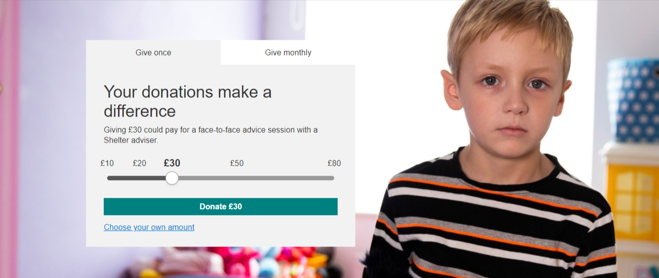
When you create a new entry (via Add entry), the fields to complete are:
Name - the entry’s name in the system
Heading - this will display as the H2 in the hero
Single amount 1 - enter the value only (no £ sign) for the lowest amount on the slider bar (£10 in the example above)
Single image 1 - use Link existing asset to find and add an image
NOTE: currently the design pattern is for using just one image for all amounts of the slider. Which means you need to add the same image for each single and month amount.Single description 1 - up to 20 words to describe what this donation amount will pay for
Repeat steps 3-5 for each single and monthly amount, using the same image each time.
Default donation frequency - select which donation type, single or monthly, you want to display when users first see the page
Publish your hero
Donation hero with input box
This is a single-donation hero normally used for appeals such as to corporate partners.

When you create a new entry (via Add entry), the fields to complete are:
Name - the entry’s name in the system
Heading - this will display as the H2 in the hero
Description - up to 20 words to describe what this donation amount will pay for
Background image - use Link existing asset to find and add an image
Default amount - enter the value only (no £ sign) that you want displayed when a user first see the page
Publish your hero
Campaign hero - to be used with cut out images only
This lets you create the new black hero banner featuring the new brand brush mark.

Campaign hero without alternate layout selected

Campaign hero with alternate layout selected and byline banner component set to overlay
When you create a new entry (via Add entry), the fields to complete are:
Name - the internal name for your hero.
Title text - the text you want to appear as your H1. You will need to add line breaks into this field using [br]. e.g. JOIN THE[br]FIGHT[br]FOR HOME

Image - For this you will need a cut out PNG. The system will automatically add the grey background when you upload. Square crops work best although you can crop using the internal image editor in Contentful. Do not use this hero with images that are not cut outs.
Alternate layout - select yes or no depending on which design you require. Yes (true) gives you a bigger image and text and is intended for use with short or single word lines. No (false) gives you smaller text allowing for more text and the addition of an optional CTA.
CTA - add a CTA component if required. CTA colour should be red as it is a primary CTA.
Remove margin bottom - defaults to yes but you can set to no if you want to keep the bottom margin.
Publish your campaign hero.
Brand hero
The brand hero uses a smaller, square hero image next to a heading and subtext. You can set the brand hero either to be used as a primary hero, which should be used at the top of a page as it makes your heading an H1, or as a secondary brand hero, which should be used anywhere other than at the top of the page as it takes the heading down to an H3.

Primary brand hero
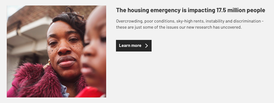
Secondary brand hero
When you create a new entry (via Add entry), the fields to complete are:
Name - the internal name for your hero.
Title text - the heading you want to appear on your hero.
Body text - add any subtext copy you want to appear on your hero.
Image - This requires a square crop but you can perform this crop on an image using Contentful’s internal image editor. If using an existing asset, please make sure that you re-upload any image you intend to crop as otherwise this will also affect content on any other page using it.
CTA - add a CTA component if required. This should have black styling.
Background colour - this can be set as white or grey.
Overlay padding bottom - If you select yes, the next component below will overlay. This is usually used with a byline banner component to create the brush mark overlay. If not using, select no.
Primary brand hero - select yes if this is a hero image for the top of a page. By selecting yes, your title text will appear as an H1. Select no if this is being used in any secondary context as it will make the title text an H3.
Remove margin bottom - select yes to remove the margin below the block.
Publish your hero.
Any questions? Email Lindsay Foley in the Central Digital team.
