
The tile grid allows you to create a line or grid of links. These can be style either in black or in white. When a cursor hovers on a tile styled in black, it will be highlighted in red.

You can create up to six links in each tile grid, which will be displayed over two lines. These use text with no image, so can be used in place of content cards where no imagery is available.
This component was created for use on Advice pages, but is now also available to be used on Page - Content templates where it has been used to replace a PDF link to the Impact Report with an accessible webpage of the full report. The Link Grid has been used specifically here to help users navigate shorter pages that each focus on a section from the report in place of a long single page hosting the whole document.

To create the tile grid
-
Create a new Component - Tile Grid in the assemblies of the page you are working on.
-
Give your grid a title, which is an internal name for the component only.
-
You can give your grid a heading if required, which will appear as an H2.
-
You may also give your grid a short description if needed, which will display as body copy.
-
Now you need to add each of your tiles. You can either create a new Component - Tile for each link or use an existing one from the content library.
-
To create a new one, click Add content > Component - Tile.
-
Add a title and your link text in the Text field.
-
You will need to choose whether you want your tiles to be either black or white in the Tile colour field.
-
You then need to set your tile’s link.
-
The component must be published before it can be reference in live content.
-
Once these fields are completed, return to your Component - Tile grid and add any more tiles you need. You can add up to six in total, which will be displayed over two lines (3x3).
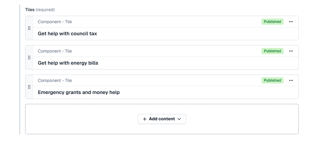
A Component - Tile grid with three Component - Tiles -
When all tiles are added, you will need to publish your tile grid to use it in your page.